Client
Year
Role
Duration
1 week
Agency
Ophion Studio
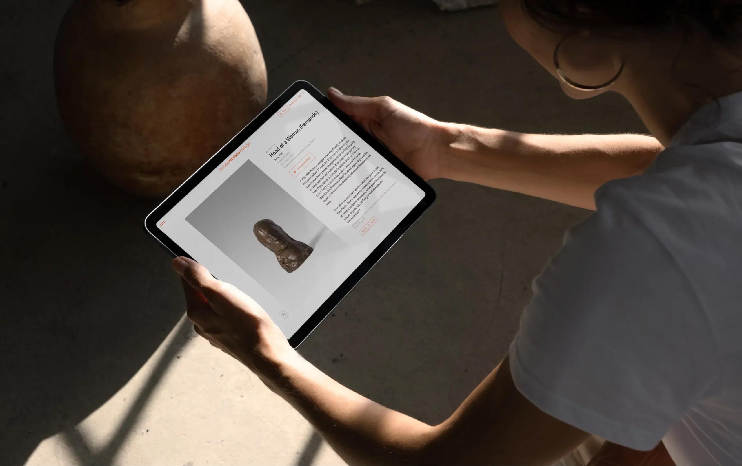
My role involved analyzing the use of typography, proposing new fonts, and establishing a simplified typographic scale to improve consistency and readability. I worked closely with a UI developer to ensure flawless implementation across all devices.
About the client
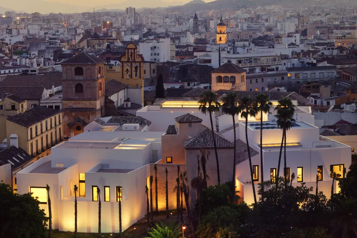
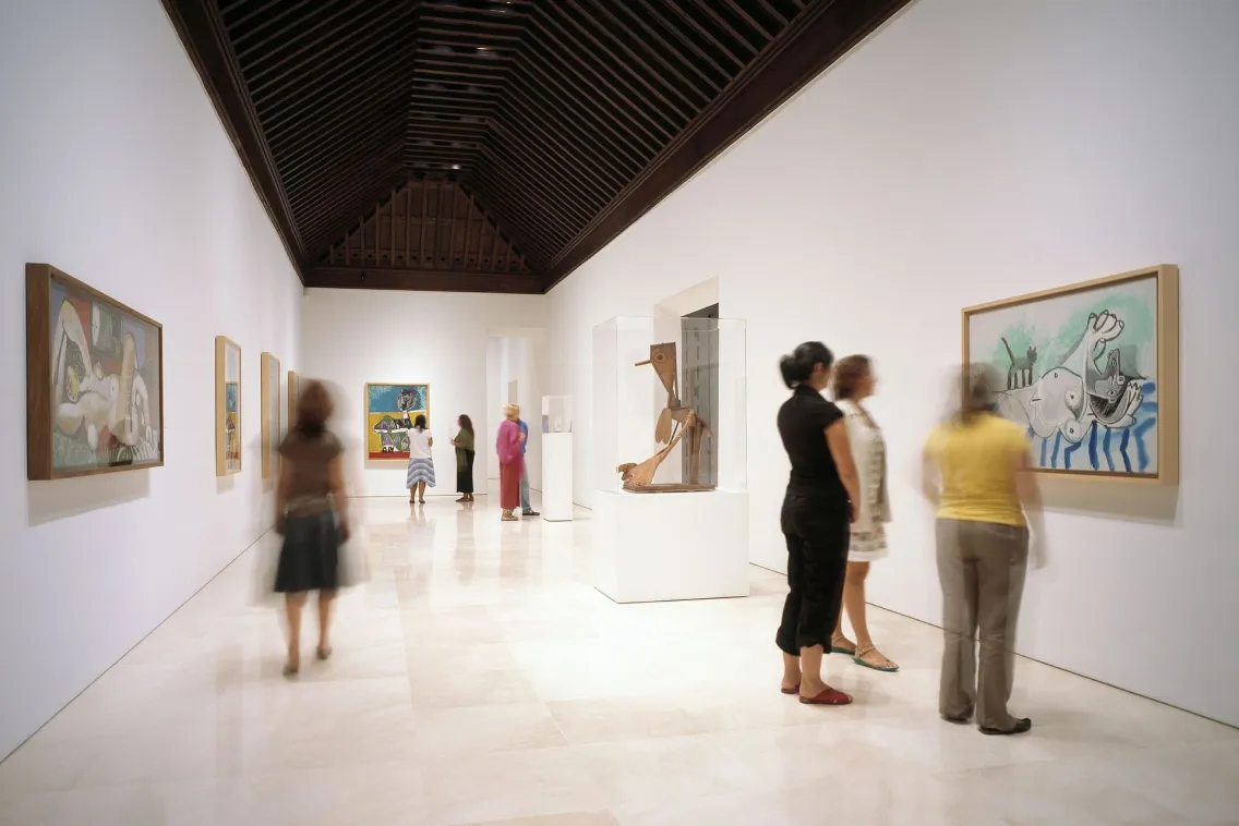
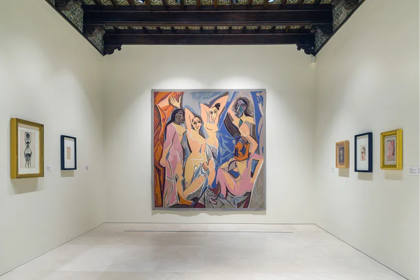
Museo Picasso Málaga is a renowned art museum located in Málaga, Spain, and one of the most visited in Andalusia. It is dedicated to preserving and showcasing the works of Pablo Picasso, with a core collection of 233 pieces by the artist.
The museum also hosts temporary exhibitions, cultural programs, and educational activities, making it a key cultural institution in the region.
The challenge
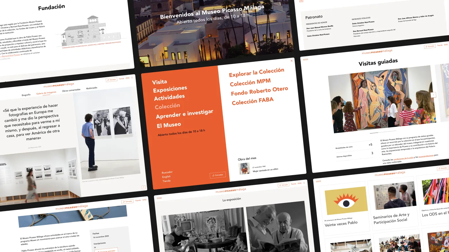
The website redesign, originally handled by another agency, revealed major typographic issues when real content was uploaded. Inconsistent use of Sans and Serif fonts, mismatched line heights, and unclear typographic hierarchies led to poor readability, impacting the overall user experience.
The challenge was to identify all components across the site, analyze what was failing at a typographic level, and create a new typographic scale to replace the existing styles.
Without access to the original design files, I worked closely with the UI developer to ensure no details were missed. With most of the content already uploaded, the client needed a quick solution to go live soon.
The process
01. Typographic Audit
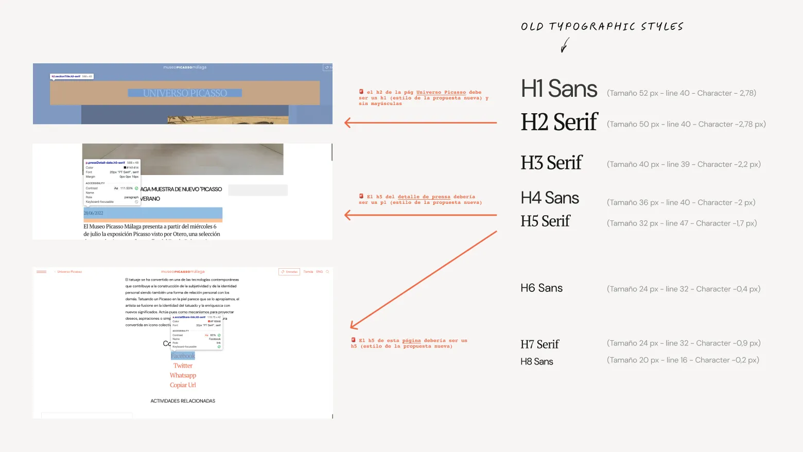
I conducted a thorough audit of all the styles used across different components on the website.
It became clear that there was a lack of consistency between the Sans and Serif fonts, with no clear structure guiding their use.
02. Font Selection
After analyzing the fonts used—PT Serif and DM Sans—I realized they didn’t align with the museum’s overall brand identity.
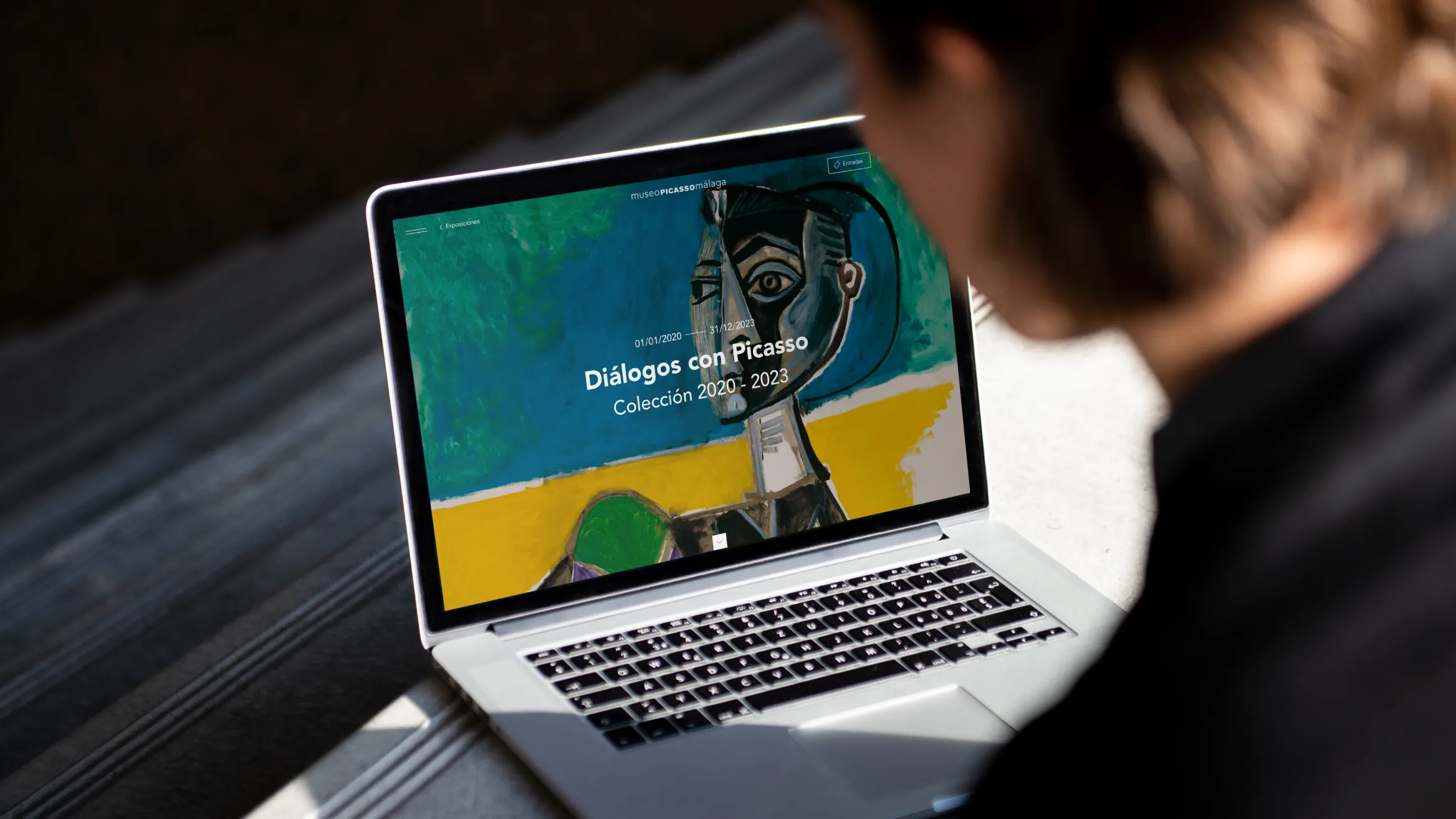
I recommended switching to Avenir, a font already used in the museum’s offline materials, so after a few tests with the different components of the web design we saw that it worked perfectly.
This choice ensured brand consistency and brought a clean, modern look to the website.
03. Simplifying the Typographic Scale
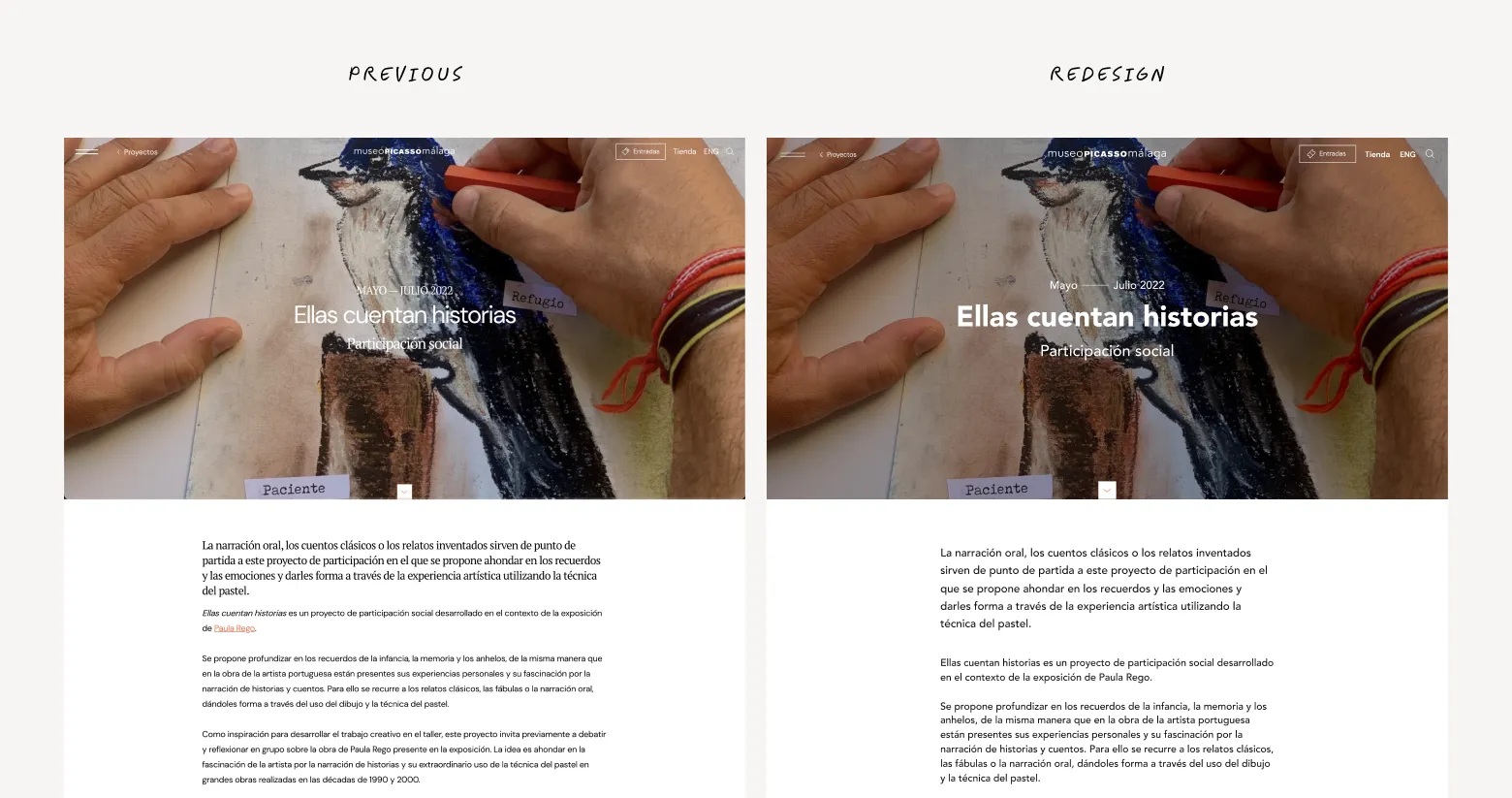
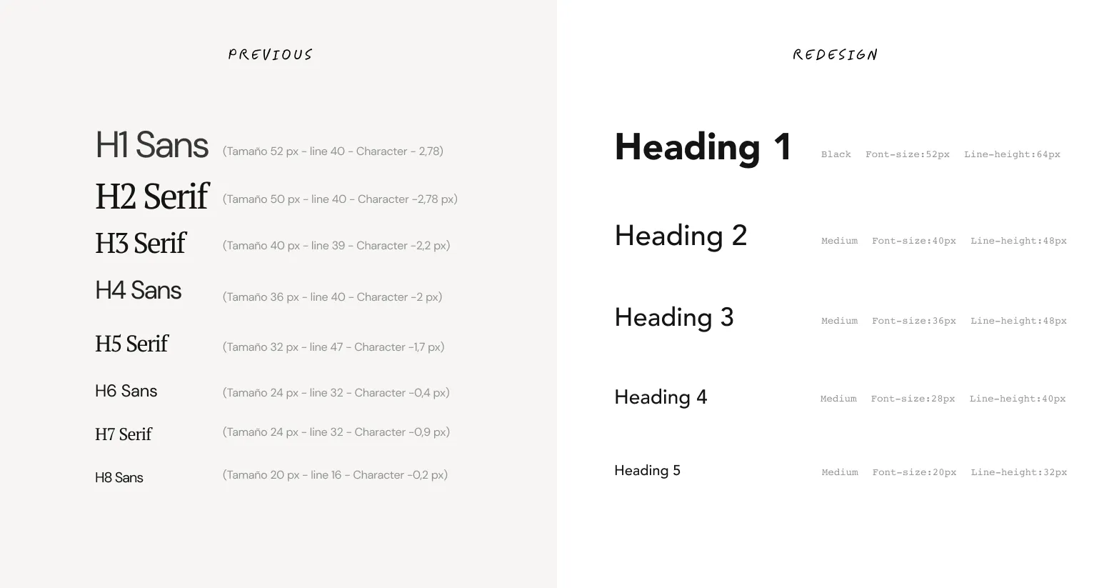
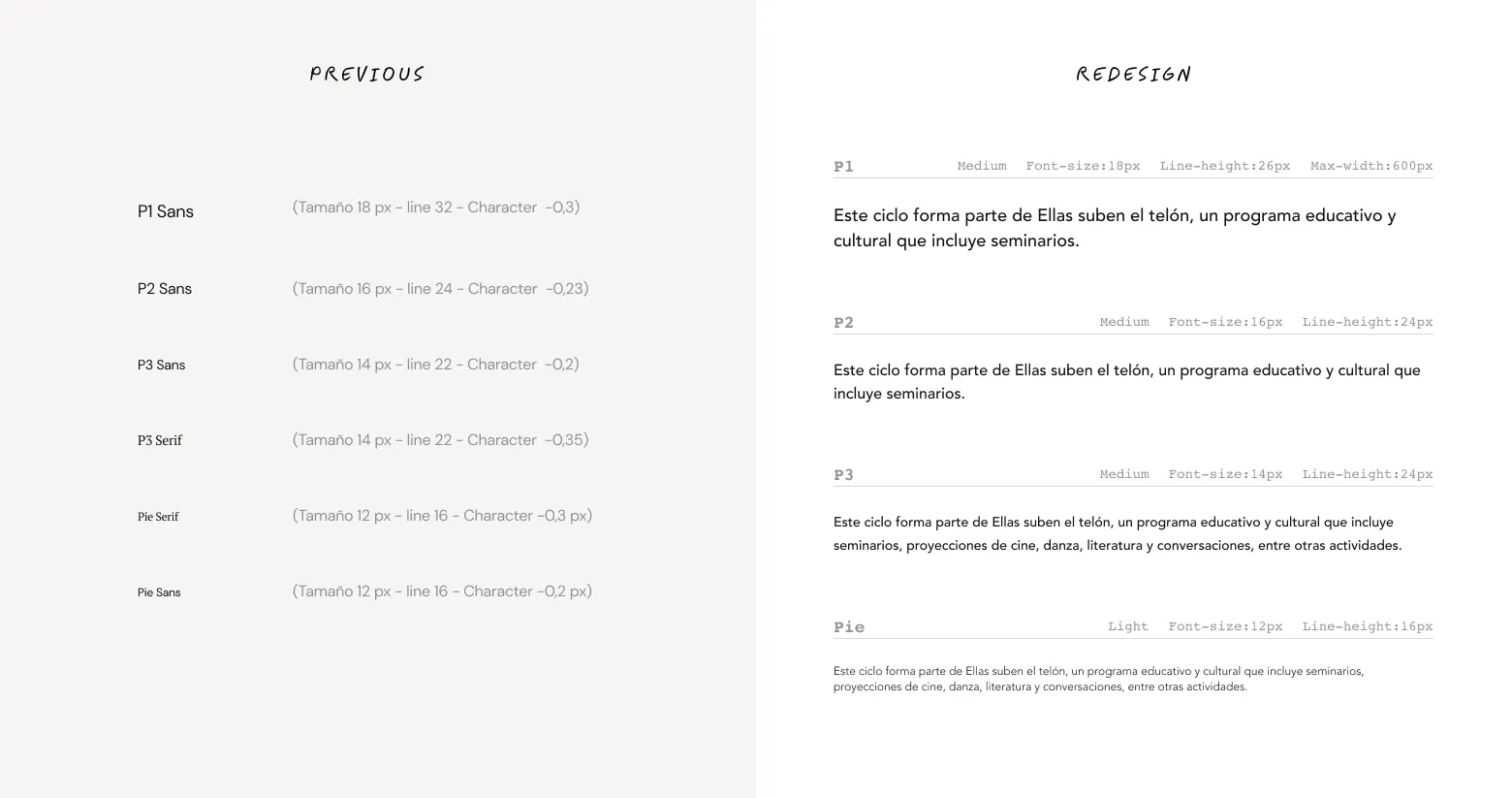
We reduced the number of title styles from 8 to 5, and the body text options from 6 to 4. This allowed for a cleaner, more structured presentation of content.
I also established a max-width for body text, improving readability in longer sections. Importantly, we removed excessive negative letter spacing and adjusted the line heights, creating a clearer reading flow.
04. Contrast and Weight Adjustments
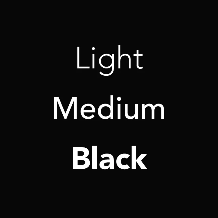
To ensure the right contrast between different text elements, we limited the font weights to Black, Medium, and Light. This decision ensured visual balance, with a clear distinction between titles and body text.
We also minimized the use of uppercase letters to improve readability, reserving them for specific headings.
05. Collaboration with UI Developer:
I worked closely with the UI developer to ensure every typographic change was correctly implemented.
Together, we conducted quality assurance (QA) tests to ensure the new scale was applied consistently across all pages and devices.

The solution
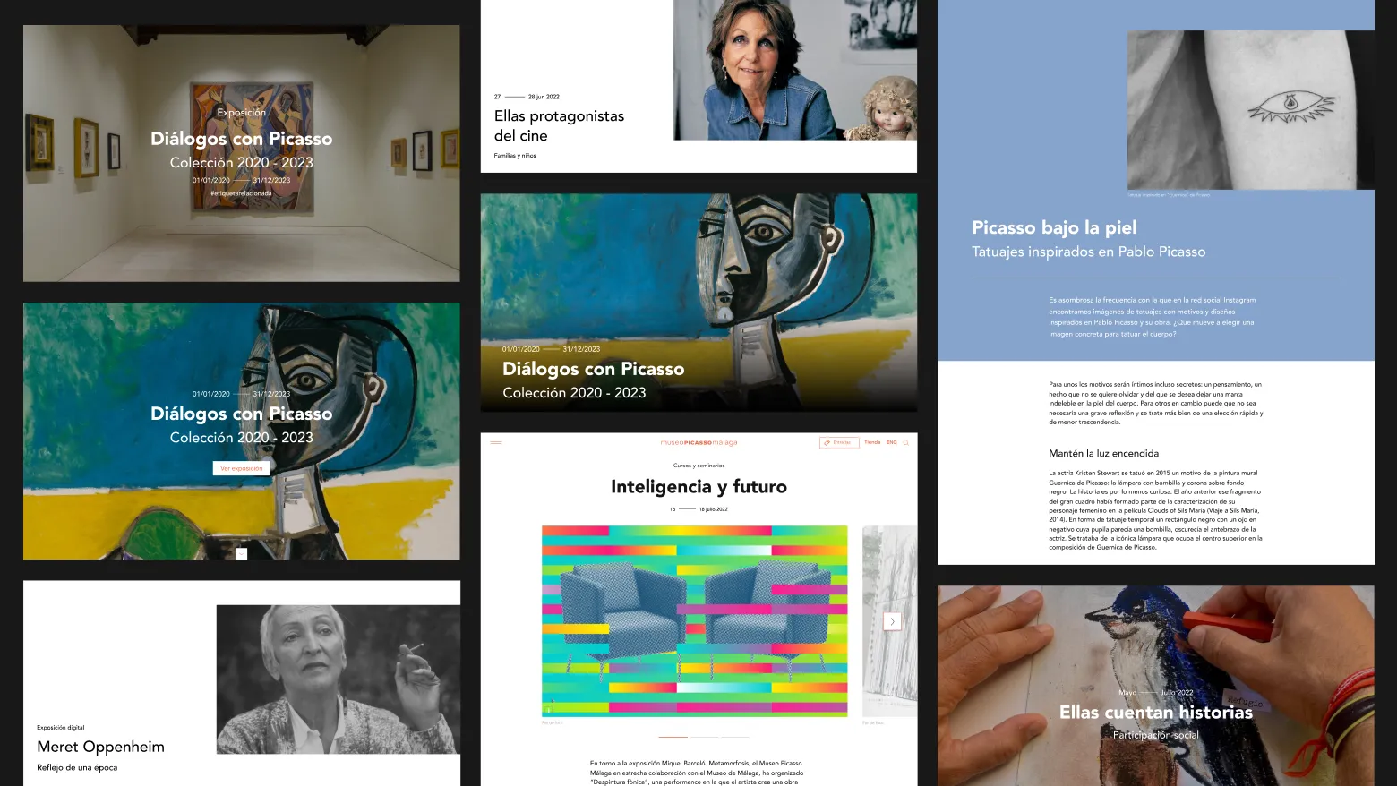
The final typographic scale introduced a simplified, cohesive structure that enhances the user’s experience by providing a clear, consistent reading flow.
The combination of Avenir with refined text hierarchy across titles, subtitles, and body content improved legibility and brought greater visual coherence and consistency throughout the entire website.
Conclusion
The new typographic scale made a significant improvement to the Museo Picasso Málaga website. Not only did it eliminate inconsistencies, but it also greatly enhanced readability and user experience.
The client was very satisfied, stating the solution “perfectly aligned with our needs” and provided peace of mind for the launch. The proposal was approved without changes, highlighting the impact of thorough typographic analysis and a clear, functional redesign.
