Client
Year
Role
Duration
2 weeks
I created a brand identity reflecting their values of proximity, seasonality, and quality, including brand analysis, competitor research, and creative direction for the logo, color palette, typography, and photography.

About the client
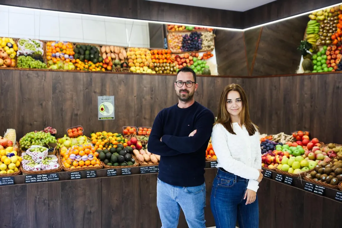
La Bona Fruita is a family business with over 40 years of experience in agriculture that grows fruits and vegetables on their own fields in Lleida. Their store in La Cerdanya has been a reference for fresh, local products for over 20 years.
Recently, they expanded their presence by opening a new store in Andorra, adding gourmet products to their offering.
The challenge
With a growing presence and new audience, La Bona Fruita needed a brand identity that appealed to a mid-to-high-end clientele while staying true to their roots. The challenge was to create a logo that communicated the proximity, seasonality, and premium quality of their products.
Furthermore, the branding had to be ready within a tight deadline to meet the launch of the new store in Andorra, ensuring the signage, packaging, and other materials were delivered on time.

The process
Moodboard
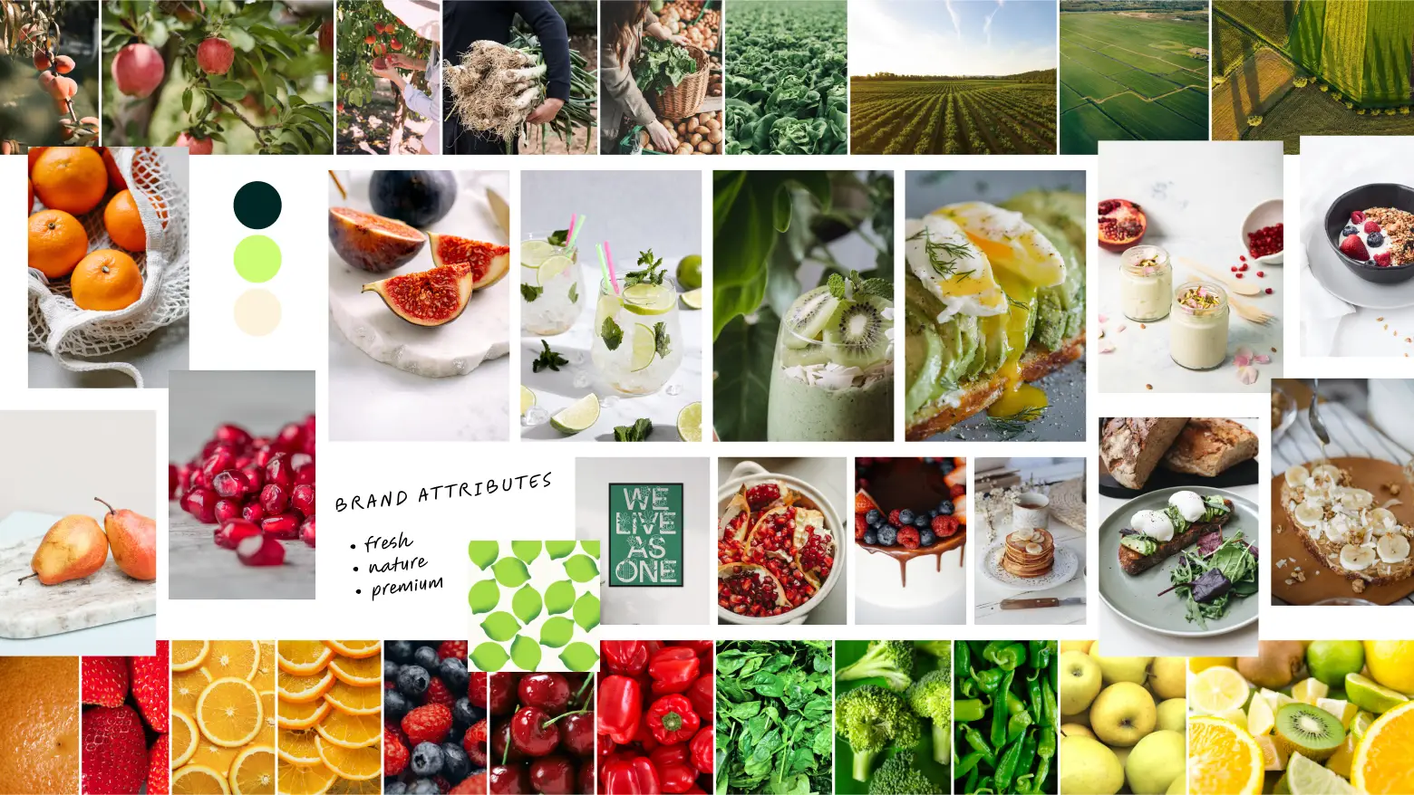
We began with in-depth discussions to understand La Bona Fruita’s values and vision. I conducted competitor research to identify key differentiators and opportunities to enhance the brand’s visual coherence.
After compiling insights, I developed a moodboard centered on natural, fresh, and premium qualities. The moodboard became the foundation for conceptualizing the visual identity.
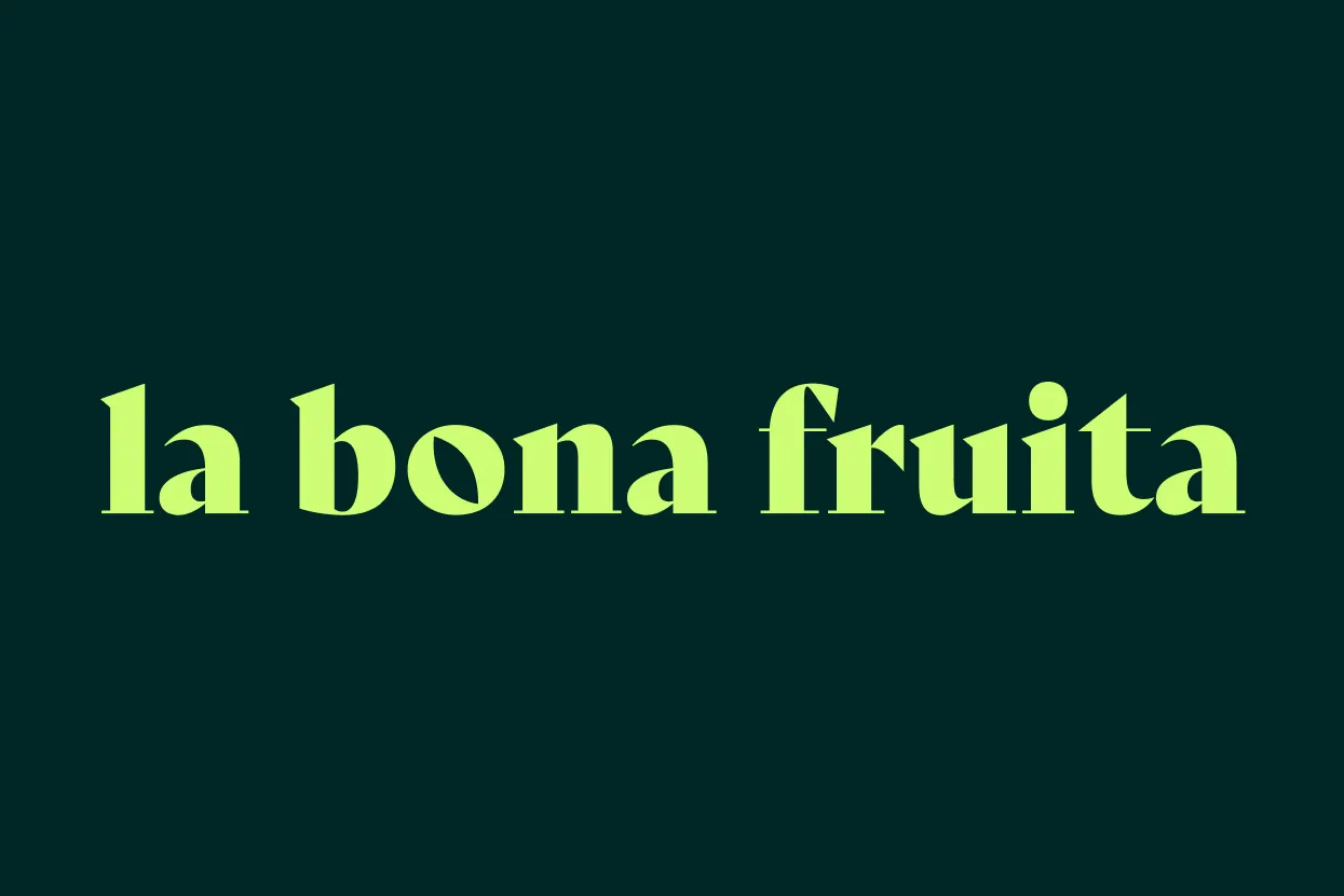
Logo Direction A
The exploration phase involved experimenting with two primary concepts.
The first direction focused on a minimalist typographic approach, emphasizing prestige and simplicity.

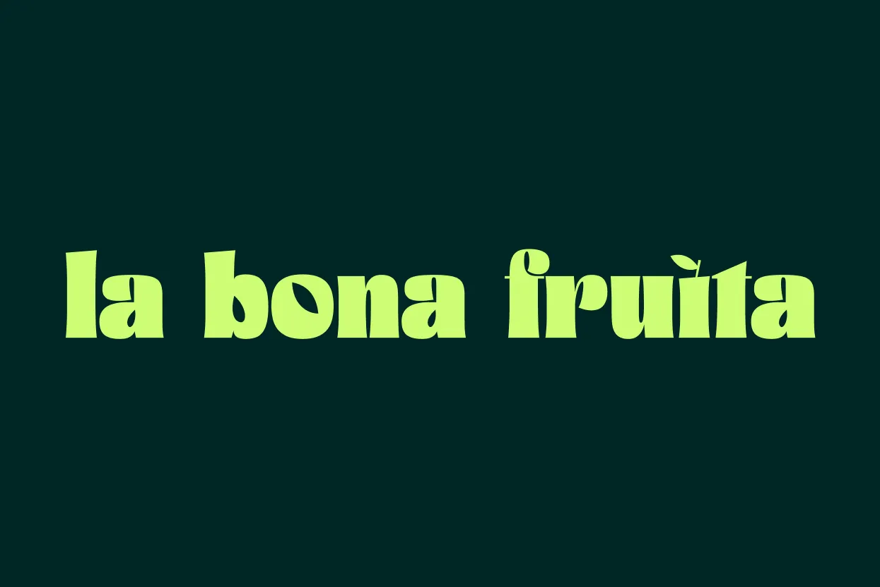
Logo Direction B
The second direction took a more literal approach, incorporating leaves and seeds as subtle nods to the essence of fruit, highlighting natural origins and growth.
Although the first direction was chosen by the client, in this case study, I will focus on the development of the second concept.

The solution
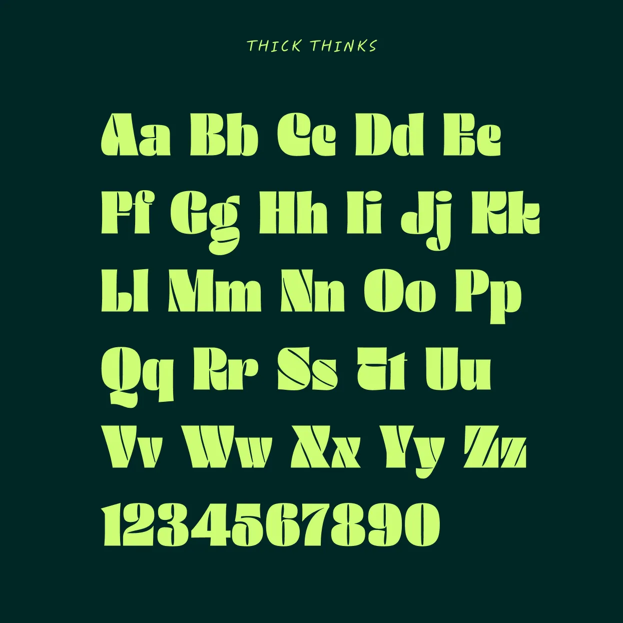
Typography
The typography chosen for this logo stands out due to its bold and voluminous character, ideal for creating a strong and memorable visual presence that conveys stability and trust.
The typeface combines organic and elegant forms, striking a balance between warmth and quality.

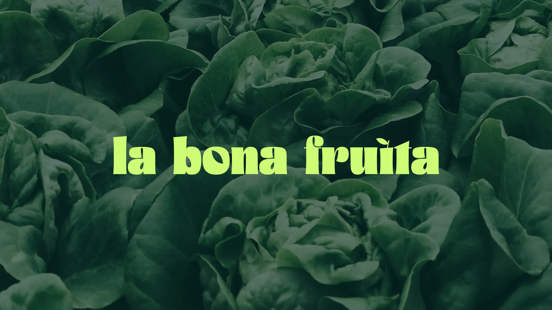
The final logo simplifies the brand name, focusing on a custom typographic solution that subtly integrates elements of nature.

Key typographic adjustments were made to reinforce the brand’s values.
• The dot on the “i” was transformed into a leaf, symbolizing growth and freshness.
• The interiors of the “a” and “b” subtly echo the shapes of seeds, reinforcing the idea of origin.


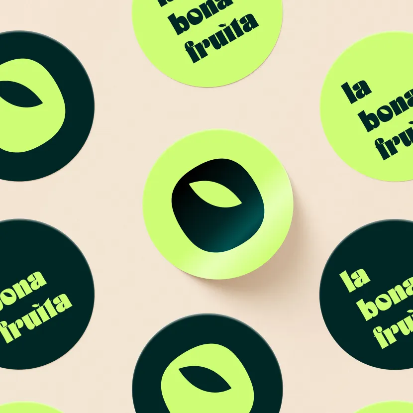
The most significant adjustment is in the “o”, where the negative space forms the shape of an apple with a leaf. This subtle design will serve as the brand’s symbol, the most reduced form of the logo.

Color
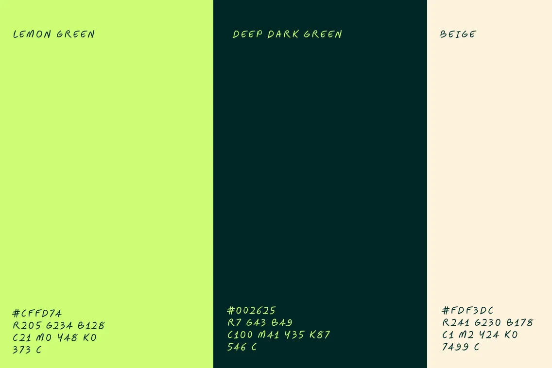
The color palette was selected to balance energy and elegance.
Lemon green represents vibrancy and freshness, while the deep dark green adds a sense of depth and luxury.
The neutral beige was chosen to represent the color of the ground, symbolizing where the products grow and emphasizing sustainability.

Photography
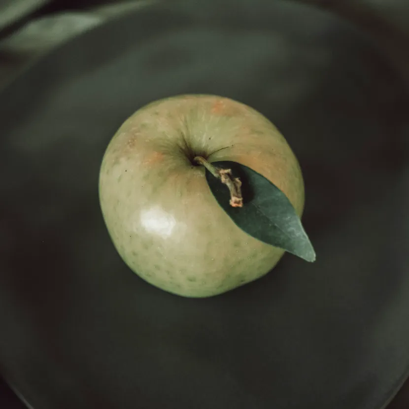
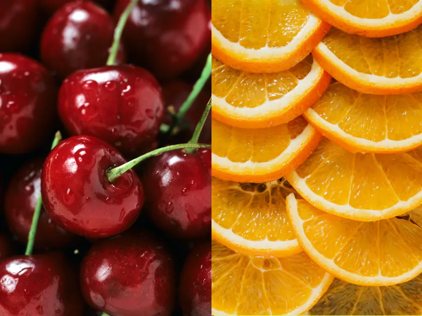
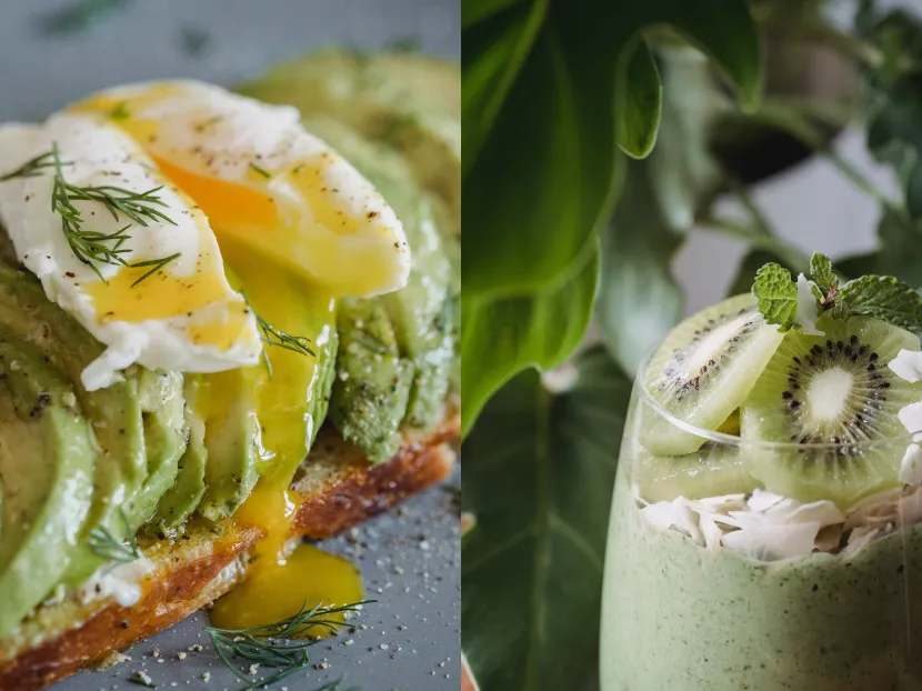
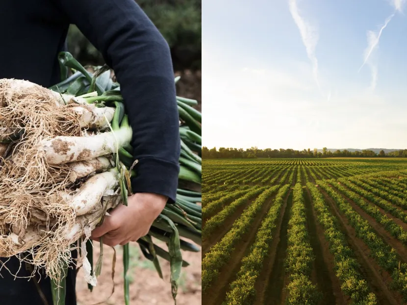
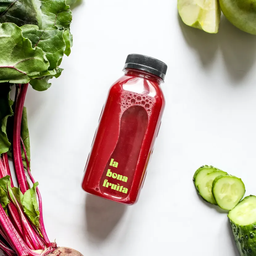
For the photographic direction, I proposed a flexible system with four distinct visual styles.
• Hero shots of fruits and vegetables, emphasizing purity and quality with clean backgrounds.
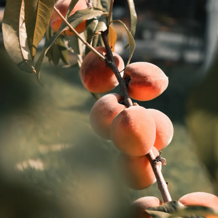
• Close-up textures, allowing customers to “taste” the product visually.

• Recipe compositions, highlighting the gourmet element.
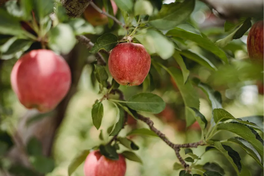
• Imagery of their fields, highlighting the care in production and the human connection behind the product.
Brand Guidelines
To ensure consistent branding, I crafted a manual with guidelines for logo, typography, colors, and photography across all touchpoints, from packaging to social media.


Conclusion
The new brand identity successfully positioned La Bona Fruita as a trusted source for local, high-quality products, resonating with their target audience.
The launch of the new store in Andorra was well-received, helping them establish a strong presence in the region. Additionally, they have built valuable collaborations with recognized restaurants in the area, further reinforcing the brand’s commitment to quality and proximity.


