Client
Year
Role
Duration
1 month
Agency
RedRadix
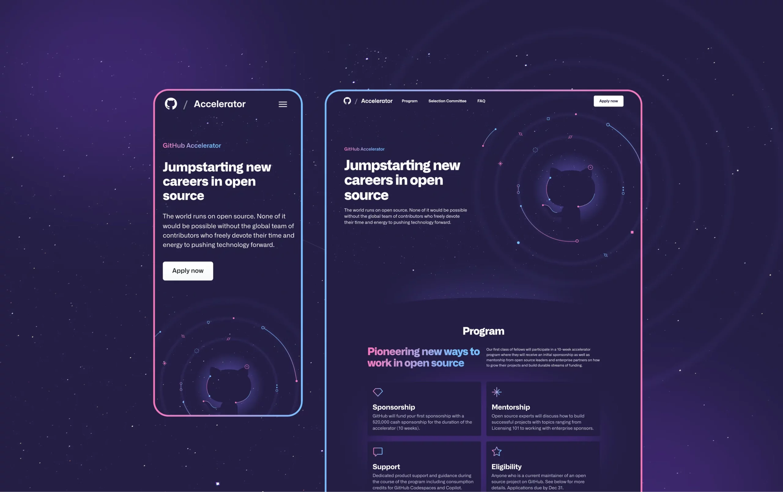
As lead designer, I developed the creative concept, UX/UI design, and hero illustration, ensuring alignment with GitHub’s brand while giving the Accelerator a distinct identity.
About the client
GitHub is the world’s leading platform for version control and code collaboration, supporting millions of developers globally. With headquarters in San Francisco, California, GitHub facilitates seamless teamwork on software projects.
The challenge
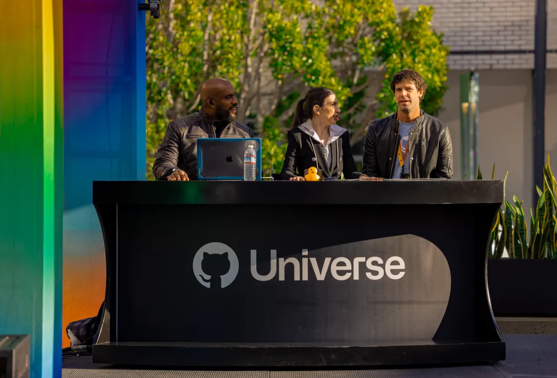
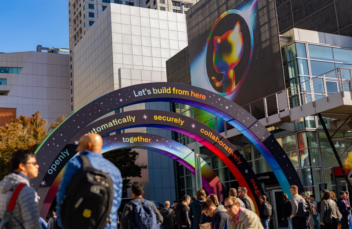
With the GitHub Accelerator debuting live at GitHub Universe 2022, we had a tight 4-week deadline to design and develop the website. The design needed to balance creative freedom with GitHub’s work-in-progress brand guidelines, which were provided after I had already shared an initial design.
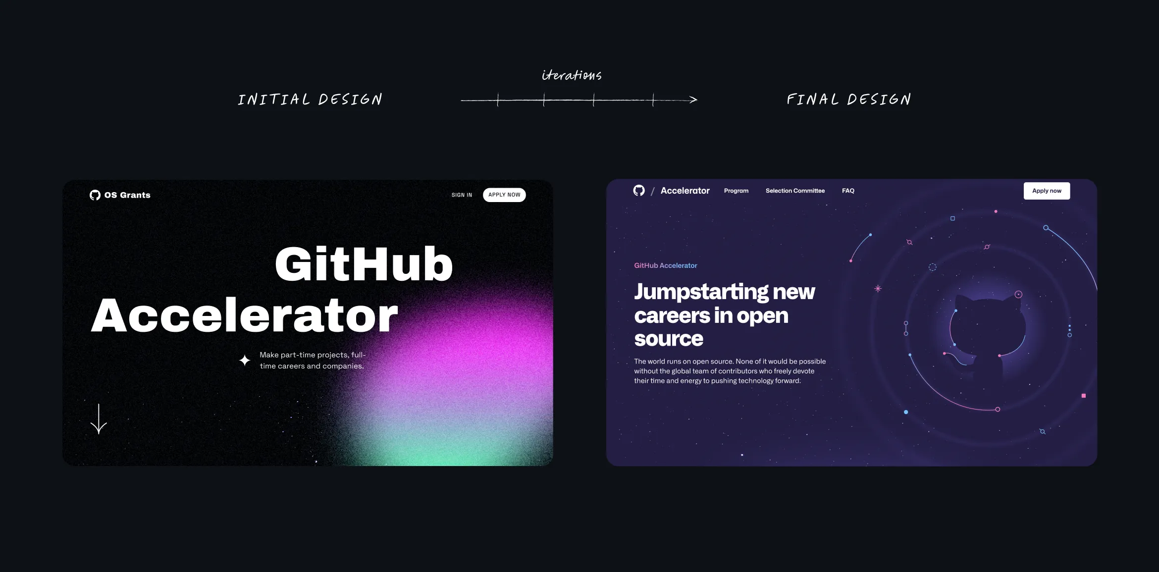
I quickly iterated to align the design with the updated guidelines, ensuring consistency with GitHub’s brand identity.
As the project progressed, the content requirements shifted significantly from the initial brief. This led to a necessary redesign of the website’s structure late in the process.
Lastly, anticipating high traffic as developers worldwide submitted applications, we conducted thorough QA testing to guarantee the site’s stability and performance under heavy load.
The process
01. Brand Analysis & Creative Concept
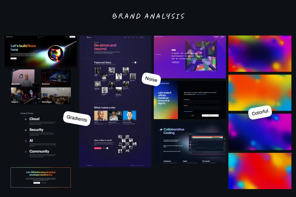
I started by diving deep into GitHub’s visual language, reviewing its use of gradients, textures, and key design elements across different platforms like web, social media, events… This allowed me understand how to align the GitHub Accelerator site with their broader narrative.
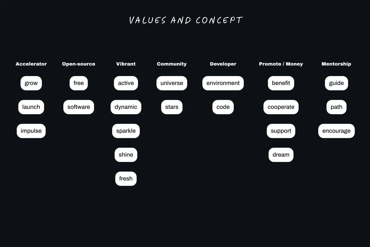
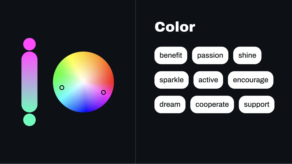
After analyzing the content that needed to be reflected on the website, I extracted key terms such as growth, universe, support.
These words became the foundation of the creative concept, ensuring the design would emotionally resonate with GitHub’s developer audience and stay true to the program’s core values.
02. Moodboard & Benchmark
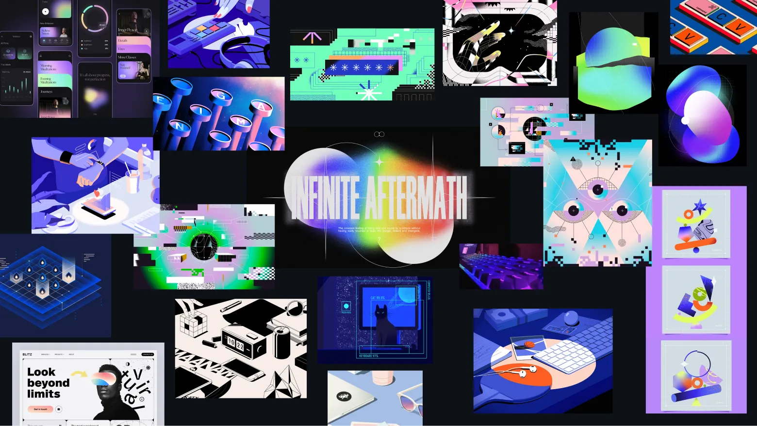
I then created a moodboard & benchmark featuring vibrant illustrations, bold colors, and organic shapes. The combination of these elements helped inspire the core concepts I wanted to convey on the website, aligning the visual design with the program’s mission and values.

03. Wireframes & User Flows
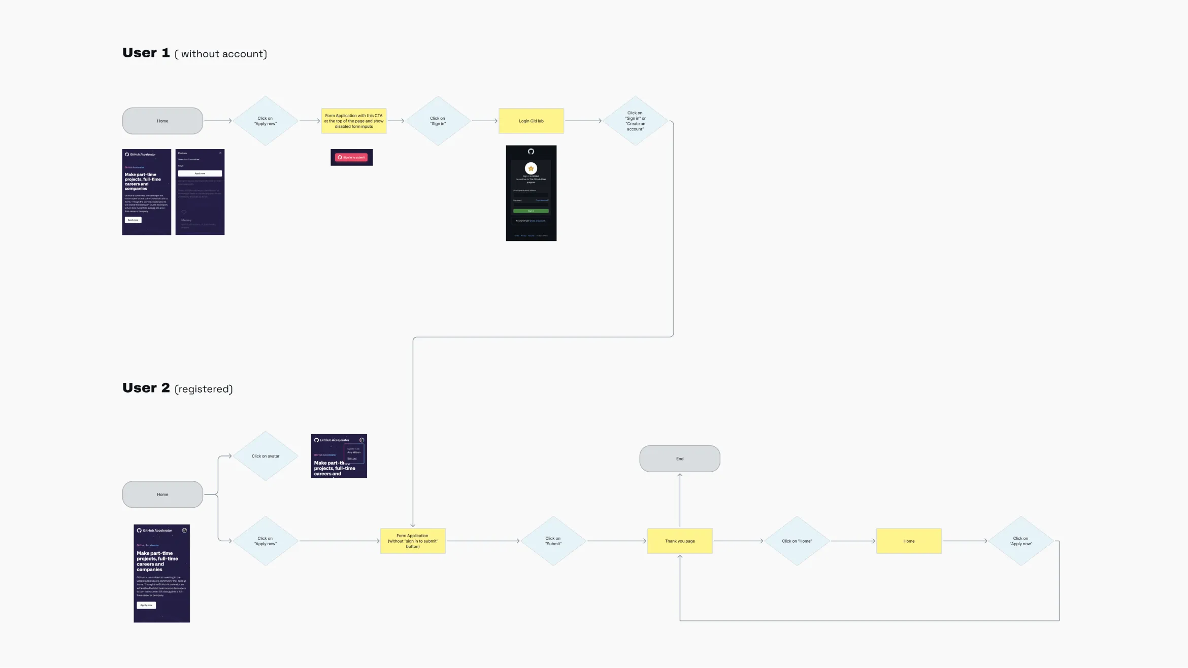
I developed detailed wireframes and user flows, working closely with the developer to ensure we accounted for all possible user scenarios.
This collaborative approach allowed us to anticipate and design for every potential case, ensuring a smooth and intuitive user experience throughout the application process.
04. Design Explorations
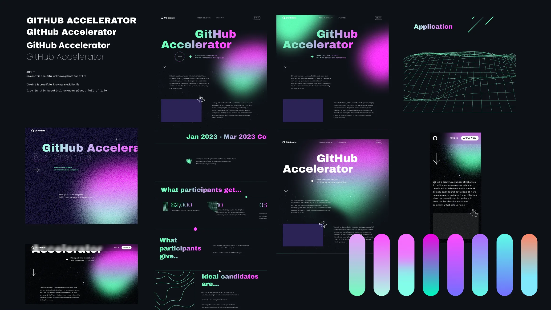
Initially, I conducted design explorations, experimenting with different typographies, color palettes, layouts, and shapes.
05. Styleguide & Web Design
Shapes & Textures
A blend of geometric shapes, hand-drawn elements, and animated organic forms symbolized the contrast between the path of the guide and freedom.
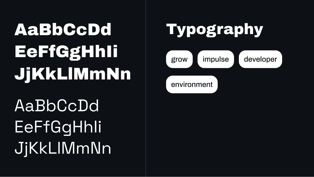
Typography
I used Archivo Black to evoke growth and strength, while Space Grotesk was chosen to represent the developer environment, referencing fonts commonly used in programming.
Colors
I utilized fluorine colors, which are made from special pigments that reflect light and are particularly striking and vibrant, perfectly aligning with our values.
The acid green evoked early digital screens, while the fluorescent pink symbolized passion and reciprocity, merging the technical with the emotional aspects of the project.



06. Client Feedback & Iterations
After presenting the initial design, GitHub provided their work-in-progress brand guidelines, requiring us to align with the new design system.
This shifted the original brief, reducing the creative freedom initially allowed, and I quickly iterated the design to meet these new standards.

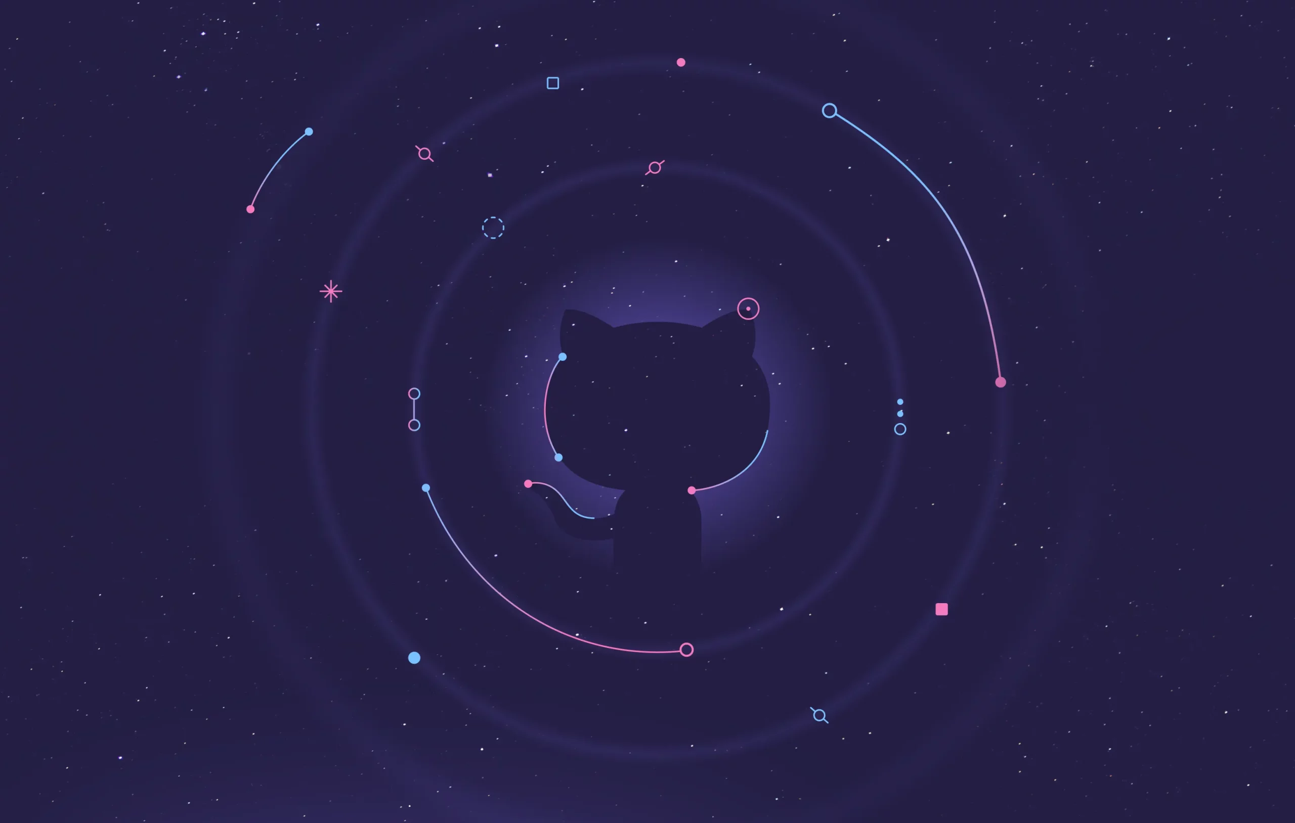
07. Hero illustration
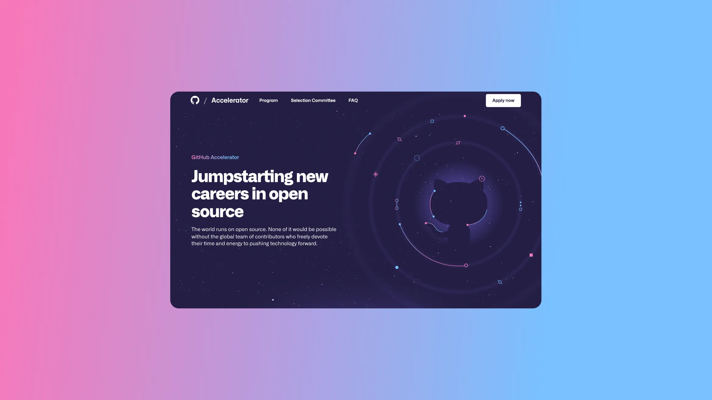
For the hero section, I created an illustration featuring GitHub’s iconic Invertocat. Surrounding it with nodes, gitlines, and a stellar backdrop symbolized the interconnected world of open-source development.
The design captured the community’s collaborative spirit and the ongoing technological innovation shaping the future of software.
08. Responsive & Atomic Design
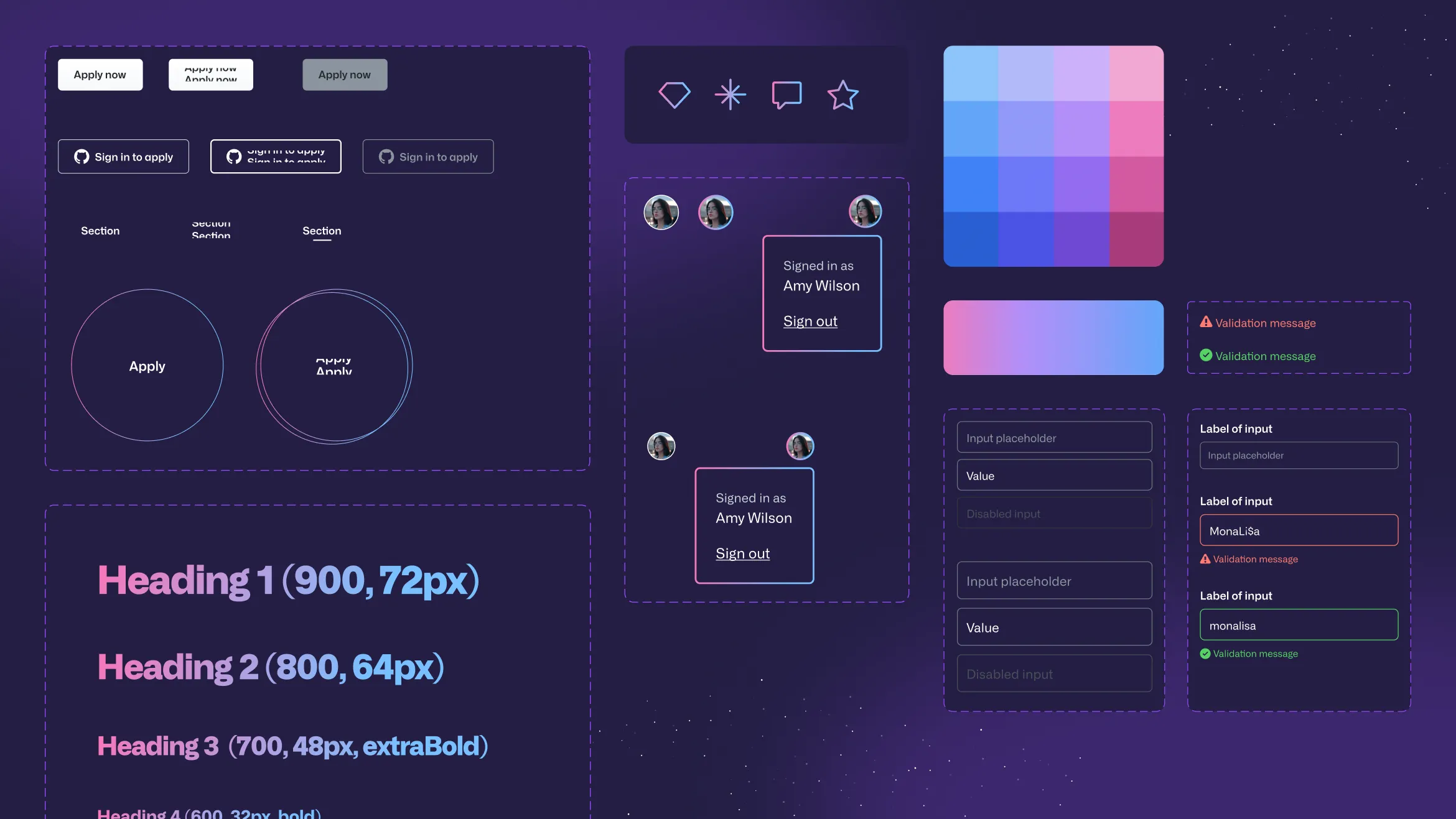
I designed the website to be fully responsive, ensuring a smooth user experience across all devices.
By applying an atomic design methodology, I created modular components that ensured consistency and adaptability, making future updates efficient and scalable.
The solution
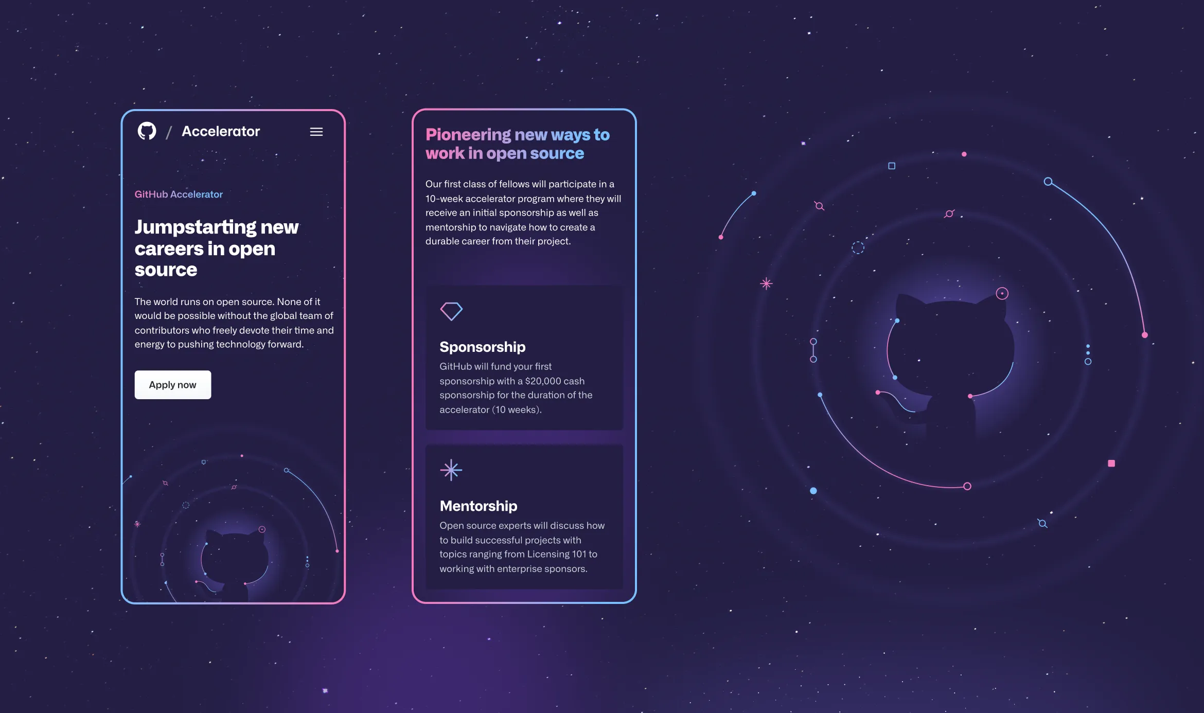
The final website offered a clean, intuitive UX, allowing developers to easily apply for the program. The hero illustration, featuring the iconic Invertocat surrounded by dynamic lines and nodes, resonated deeply with GitHub’s developer community, highlighting the collaborative and innovative nature of open-source work.

Conclusion
Despite tight deadlines and evolving requirements, the GitHub Accelerator website launched successfully at GitHub Universe 2022, receiving over 1,000 applications from developers worldwide.
The site’s design struck the perfect balance between GitHub’s established branding and the need for a distinct program identity, proving that great results come from agile, creative collaboration.
