Client
Year
Role
Duration
1 week
Agency
Runroom
Brand design by
Toormix
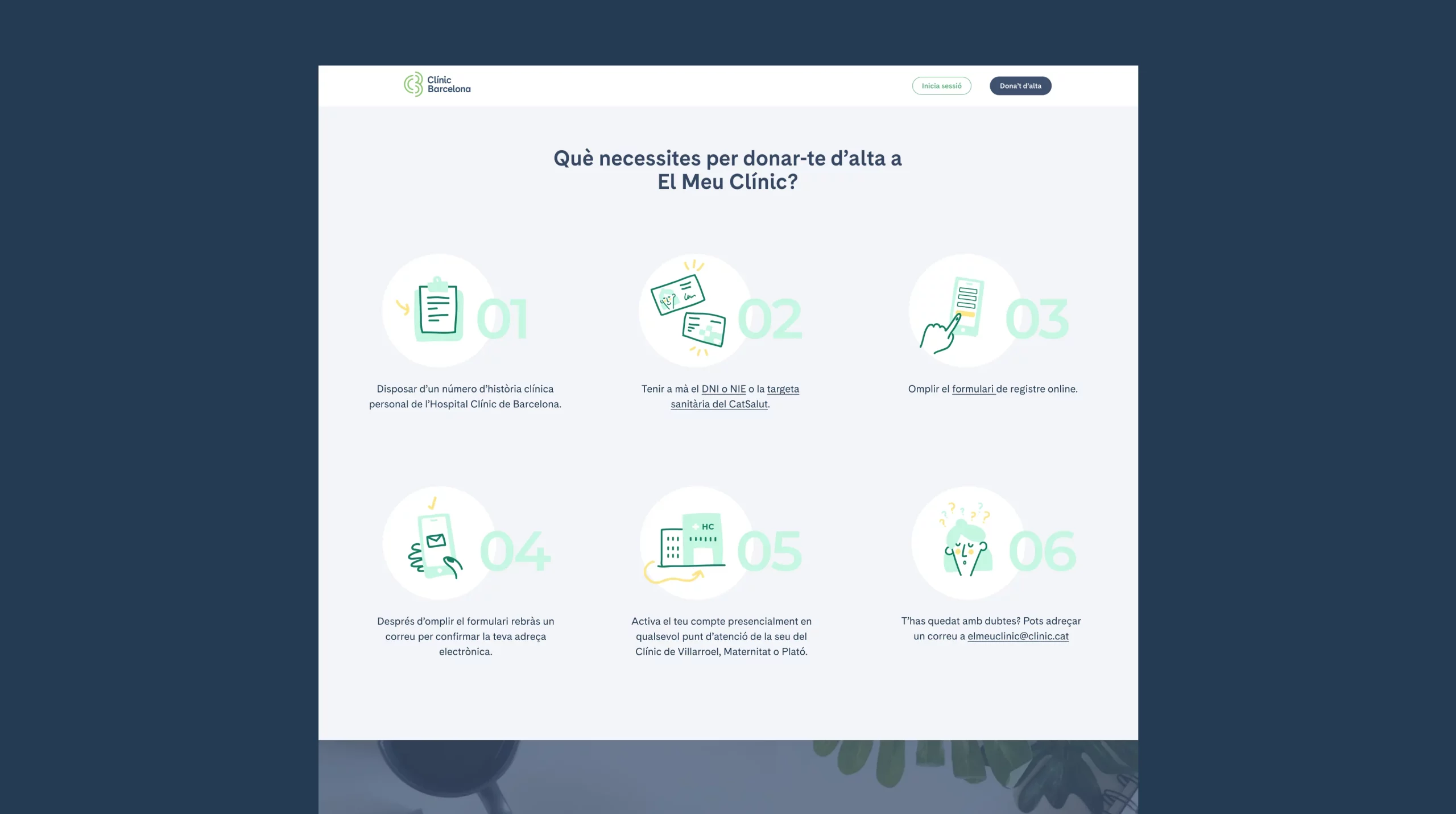
I worked on both the UX/UI of the landing page and the creation of these illustrations.

About the client
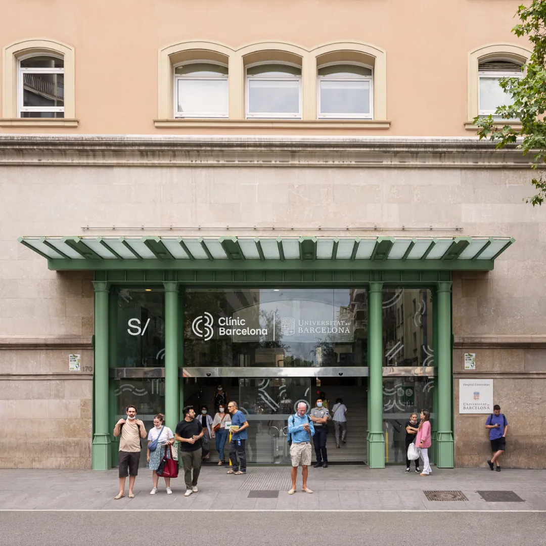
Hospital Clínic de Barcelona is a public healthcare center recognized both nationally and internationally for its excellence in healthcare, research, and education. With over 100 years of history, it serves more than 500,000 people and provides highly specialized care in various medical fields.
The challenge
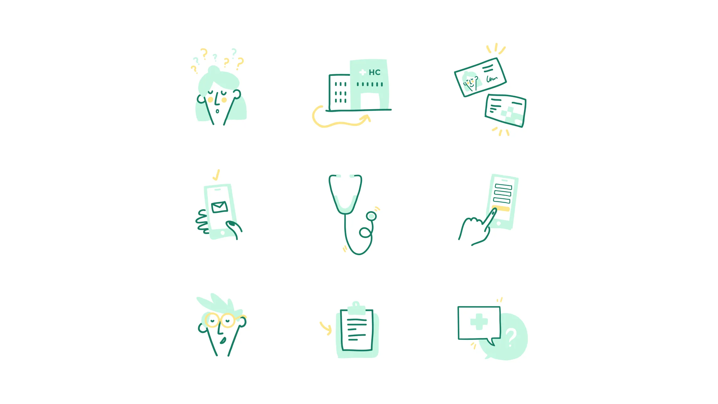
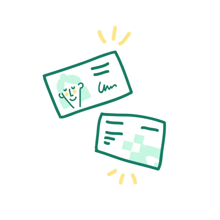
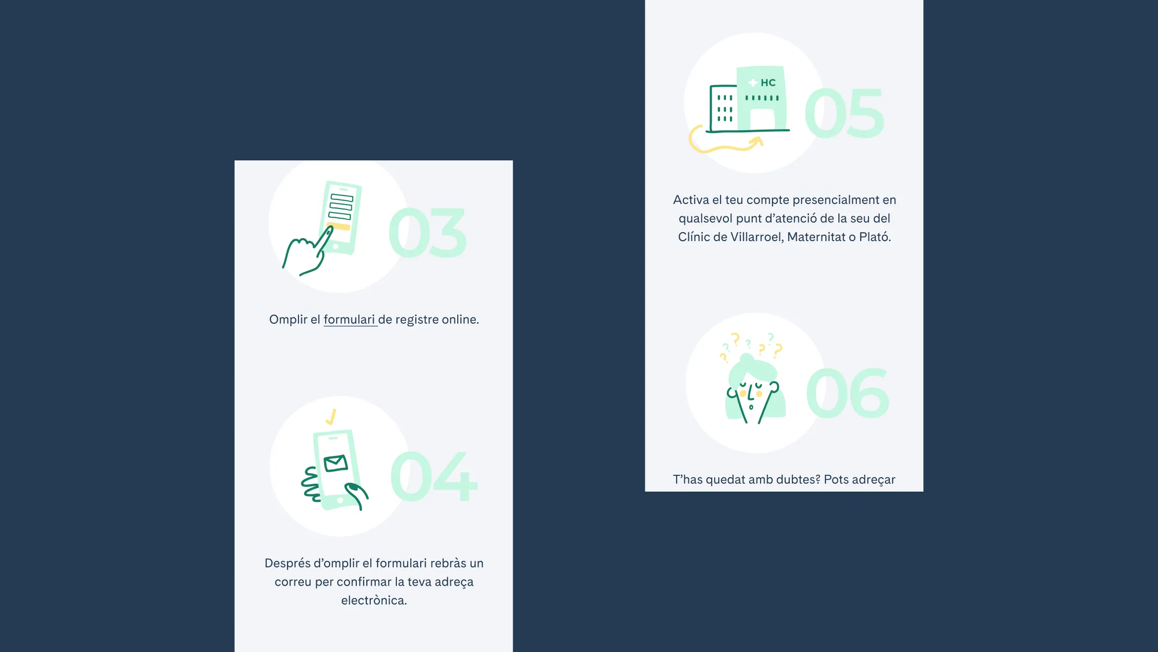
The client needed clear and friendly illustrations to accompany a step-by-step guide for registering on El Meu Clínic, a platform designed to improve patient-hospital interaction.
The challenge was to create visuals that were accessible, easily understandable, and could guide users through the onboarding process, regardless of their tech proficiency or age. This was crucial, as a significant portion of the target audience wasn’t tech-savvy.

The process
Due to a tight deadline, I quickly sketched the illustrations directly in Illustrator, focusing on clearly representing each registration step. After client approval, I added color using the hospital’s brand palette, originally developed by the Toormix design studio and integrated into the design system for consistency across all digital platforms.
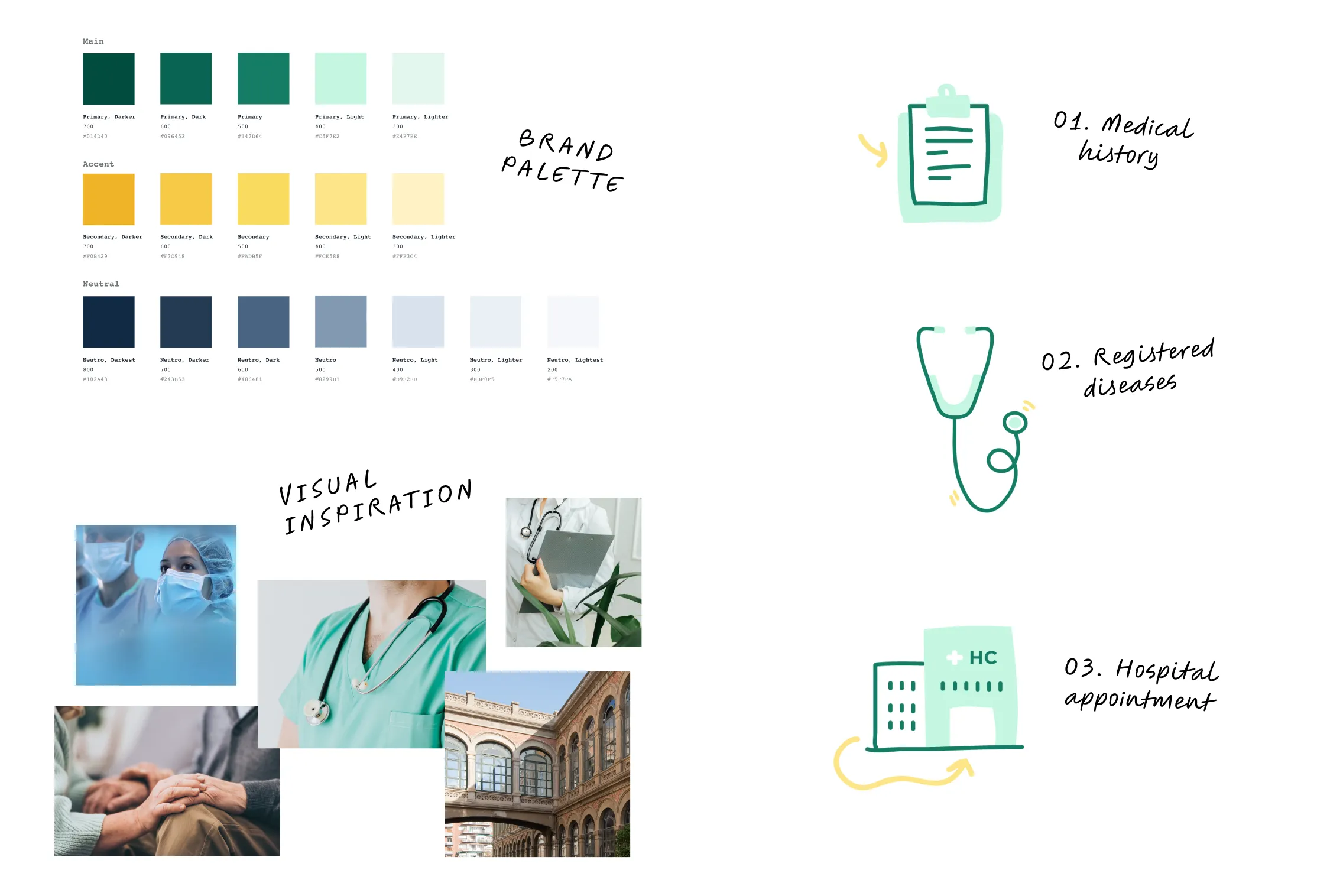
I chose an approachable and playful style, using minimal line art combined with vibrant colors to evoke trust and simplicity.
The characters and objects have slightly exaggerated expressions and shapes, making the visuals easy to interpret. This approach adds warmth to the healthcare setting, helping users feel more comfortable and able to process information quickly and without stress.
The illustrations were exported in SVG format to ensure scalability and optimize the website’s performance, preserving image quality at any screen size.

The solution
The final illustrations provided users with a clear, step-by-step visual guide to complete their registration. Each image was carefully crafted to represent key actions such as filling out forms or verifying information, reinforcing the content of the landing page while enhancing the user experience.
This cohesive combination of visual design and UX created a more intuitive onboarding flow for patients.
Conclusion
The illustrations were well-received, contributing to the platform’s success, with 54,000 users onboarded to date. Feedback highlighted their clarity, improving the overall UX. Each month, over 1,500 people register on the platform, and daily interactions with medical reports and results reach 1,200 views.
This project demonstrated the power of visual storytelling in a healthcare context, effectively bridging the gap between technology and patient accessibility.
