Project
Year
Role
Duration
1 week
Agency
Runroom
Working alongside Jorge Valencia, who took care of the UX/UI design, my role was to create four illustrations that reinforce the content’s message while fitting harmoniously into the page design.

The challenge
The Lean UX landing page needed to simplify complex concepts in an engaging way. The challenge was to visually express themes like collaborative teams, iterative processes, and the impact of Lean UX on organizational culture.
With a tight deadline, the goal was to create illustrations that enhanced the storytelling without overshadowing the text, while ensuring they adapted seamlessly across different devices.
The process
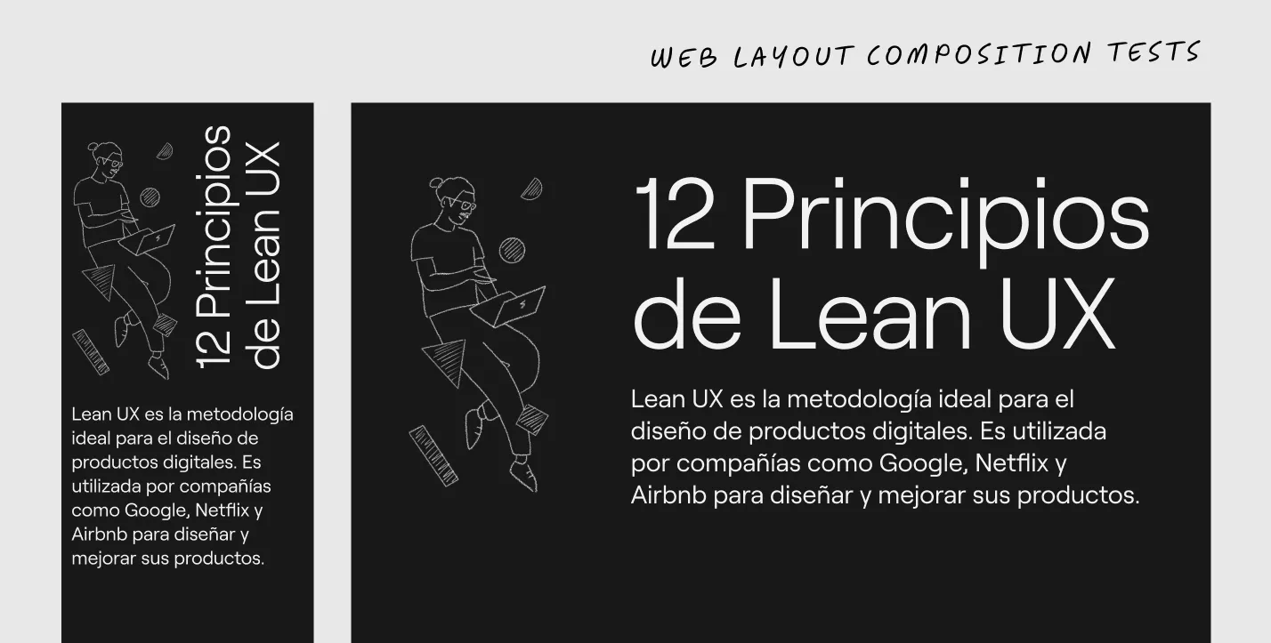
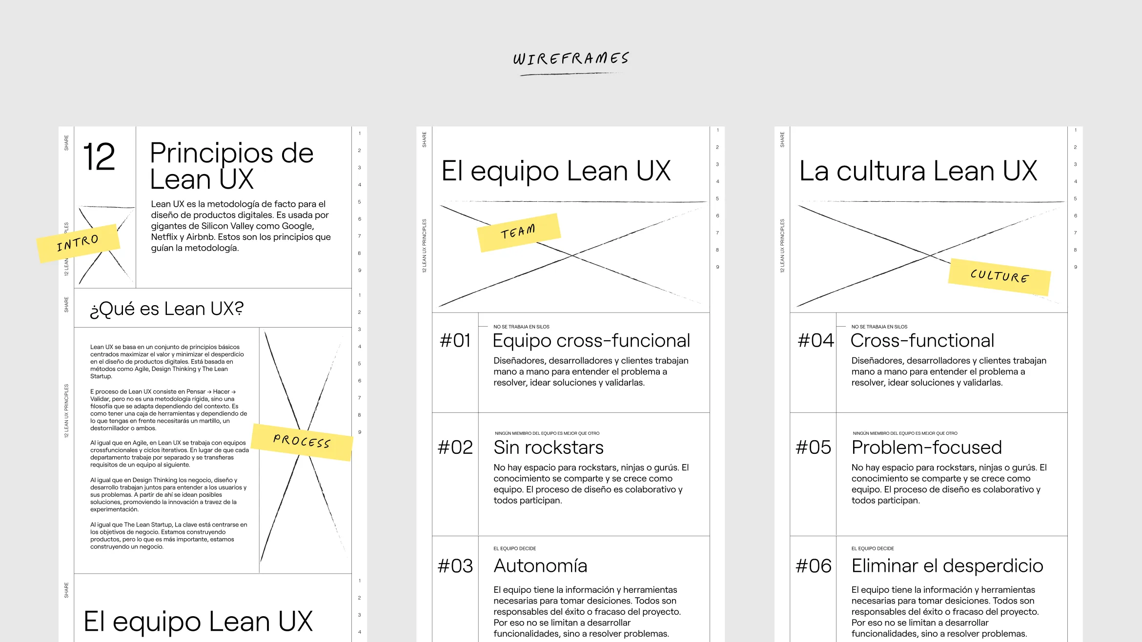
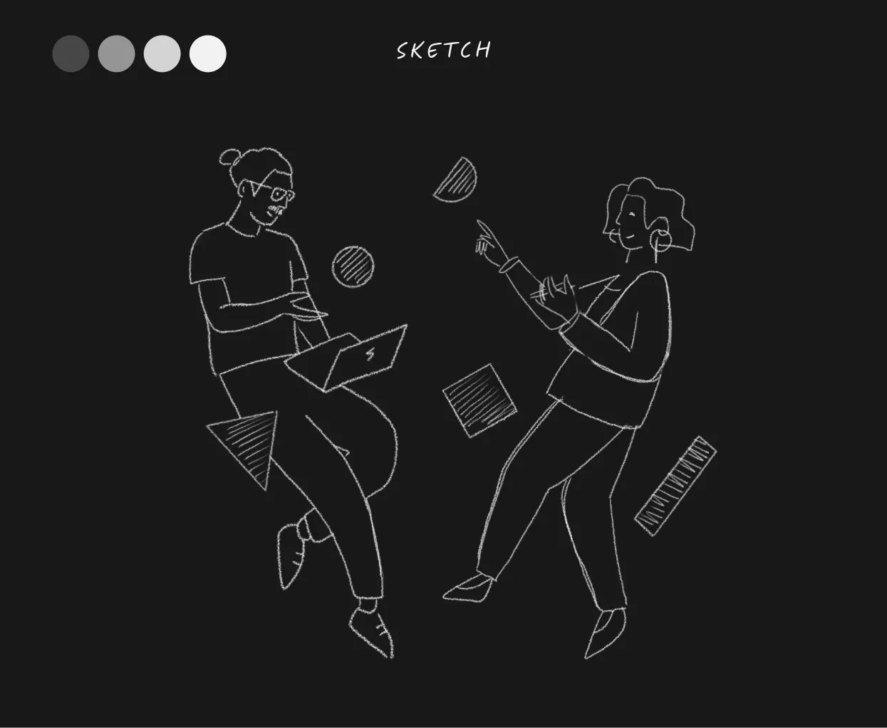
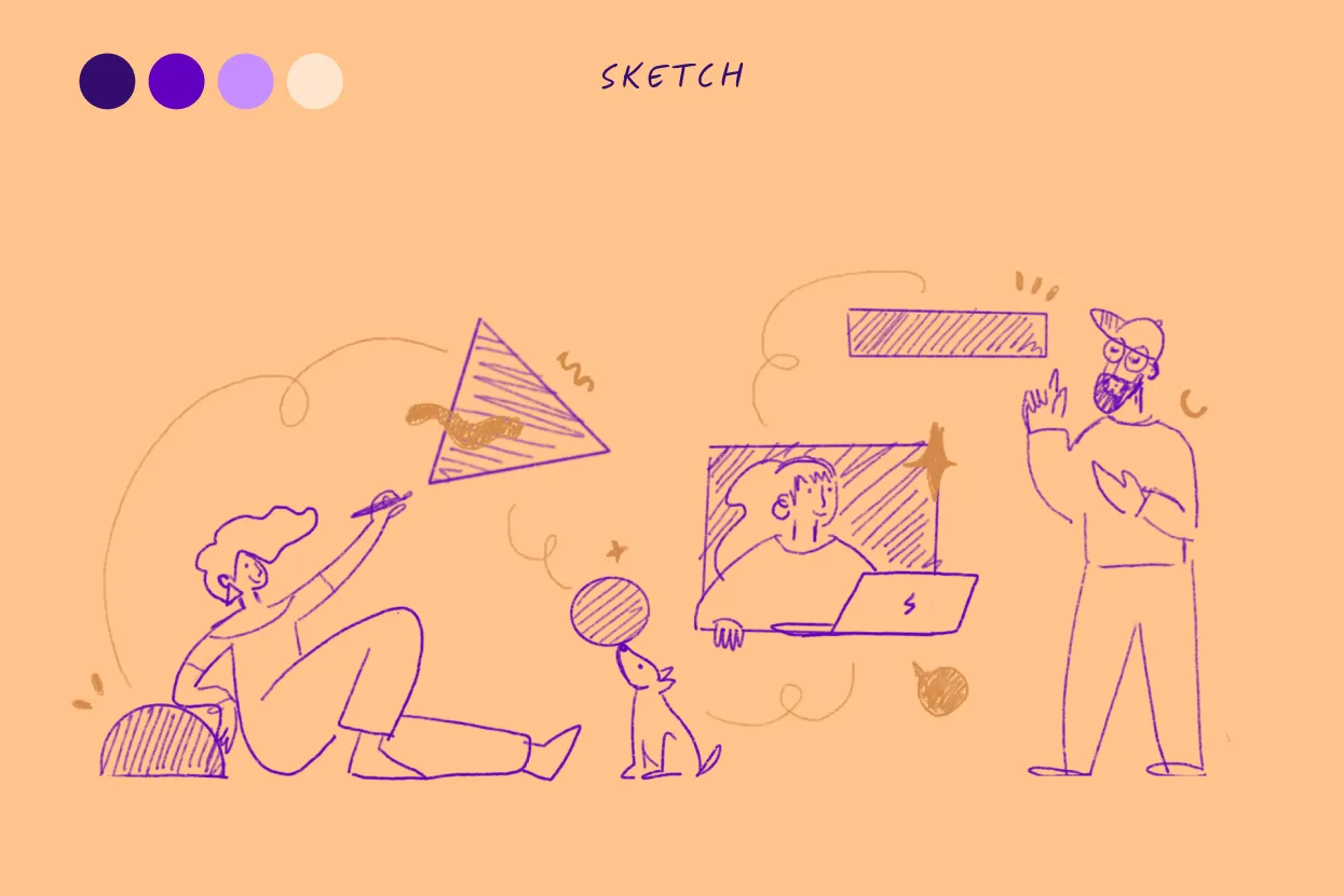
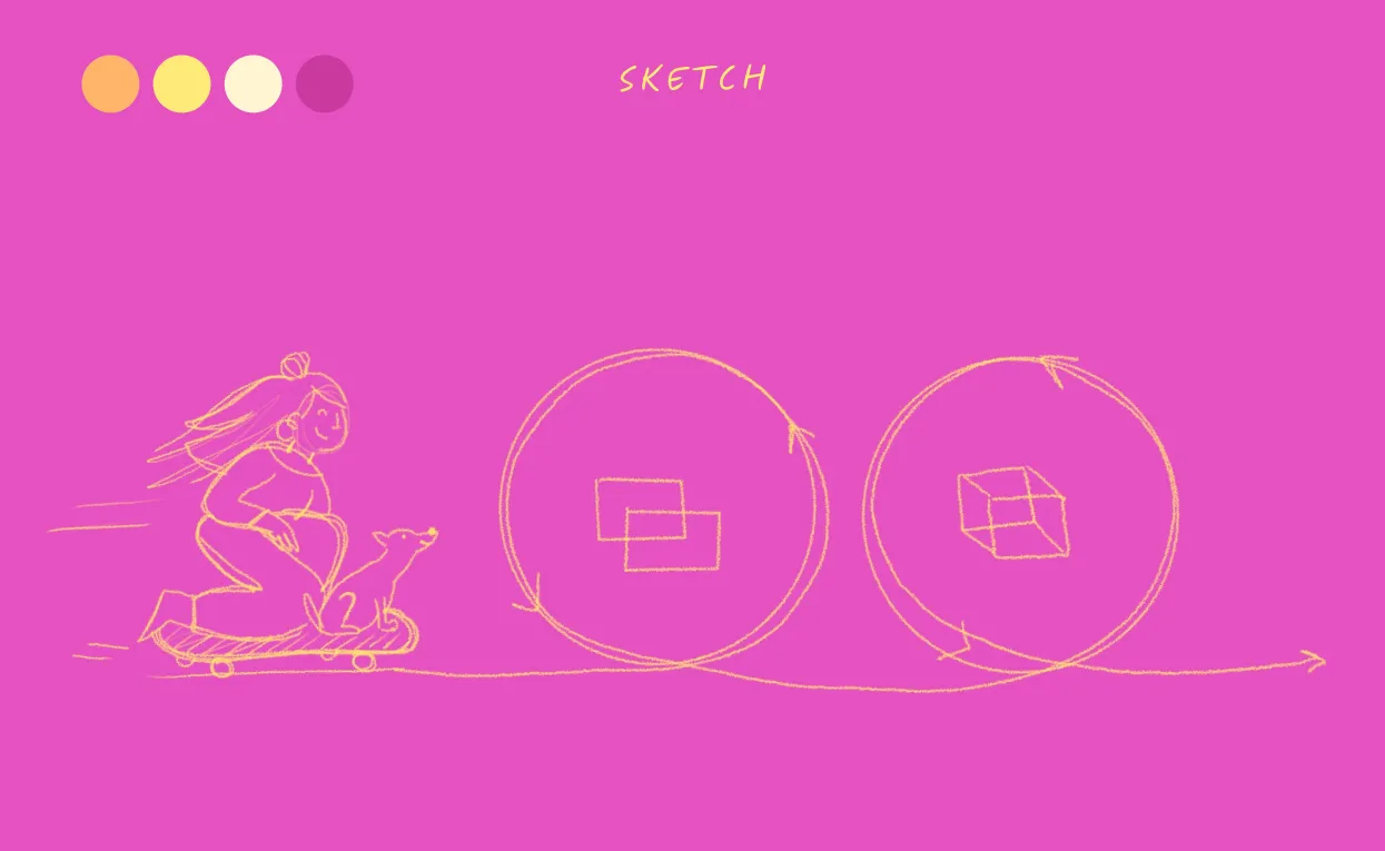
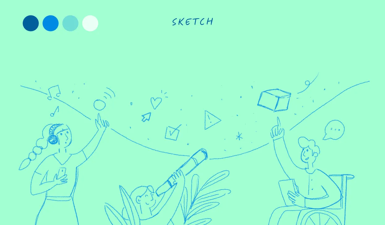
My process began with an in-depth review of the web copy to understand the Lean UX concepts and extract key insights that could be translated into visuals. Together with the UX/UI designer, we identified the areas where illustrations would add the most value, agreeing to create four main visuals representing Team, Process, Culture, and an introductory piece.
01. Discovery
• Gathered references that aligned with the project’s tone.
• Explored different ways to visually express Team collaboration, iterative processes, and organizational culture.
• Used the crazy eight technique to quickly conceptualize multiple ideas for each theme, eventually narrowing it down to a more cohesive direction.
• After validating these rough sketches with the team and ensuring they aligned with the landing page layout across various screen resolutions, I moved forward with the final illustrations in Procreate.
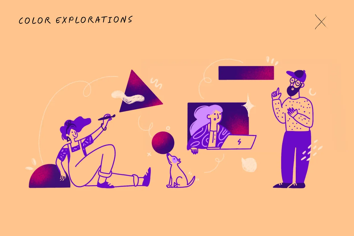
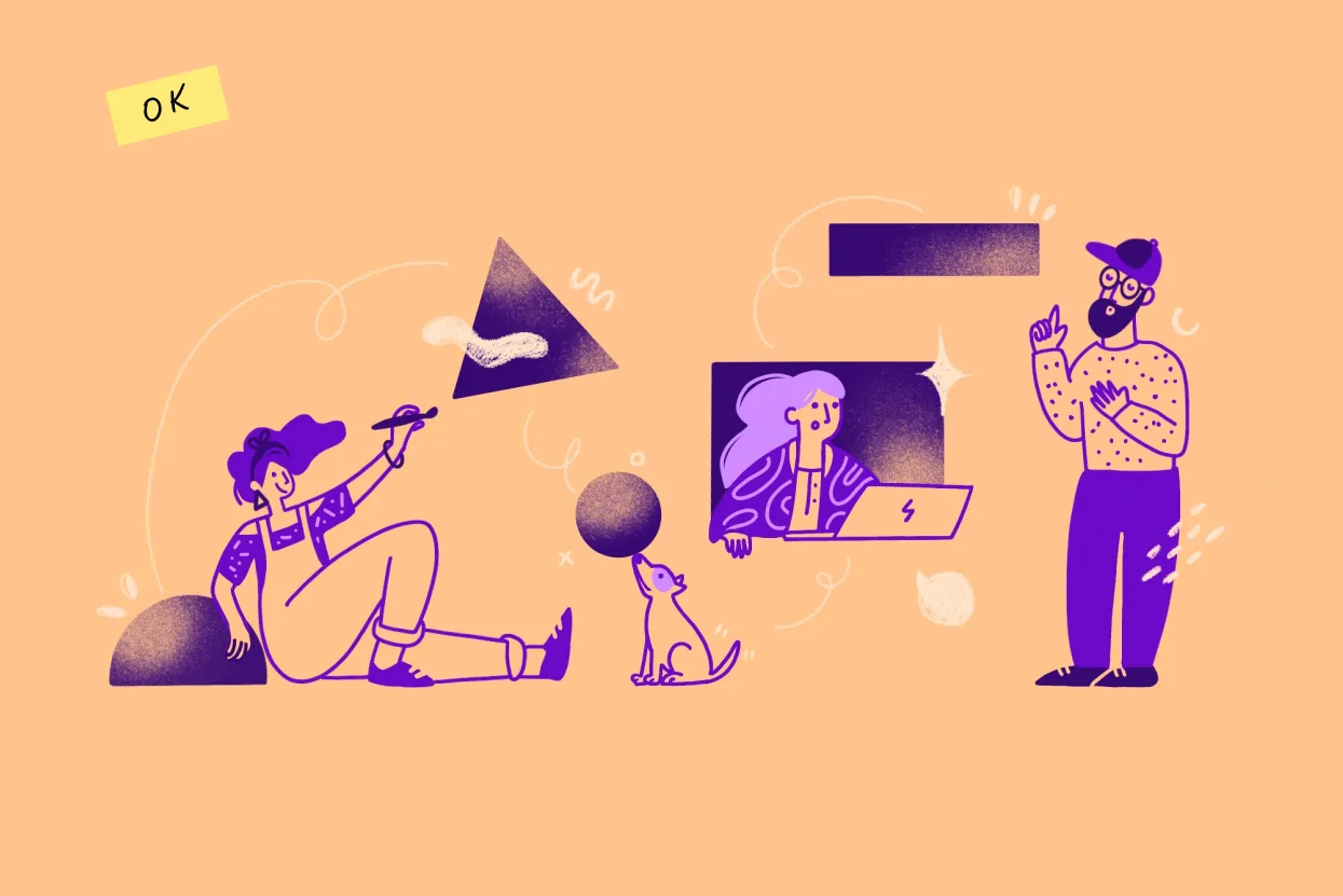
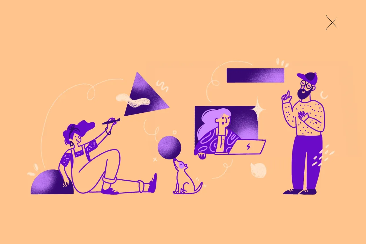
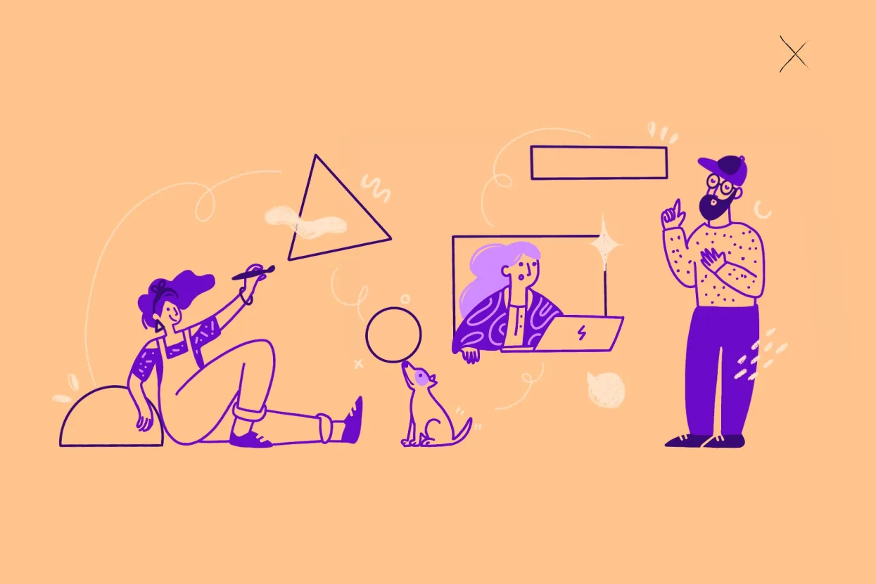
02. From sketch to final illustration
• Selected brushes and a color palette aligned with the landing page’s UI design, incorporating spray textures as a subtle nod to Runroom’s new brand identity, crafted by Folch Studio.
• I combined linework and solid shapes to create light, breathable illustrations that balanced the dense content of the landing page without overwhelming the layout.
Although we initially considered adding animation to enhance the interaction, the tight deadline led us to prioritize static designs. However, the visuals still achieved the desired impact of making the Lean UX concepts easier to digest for users.

The solution
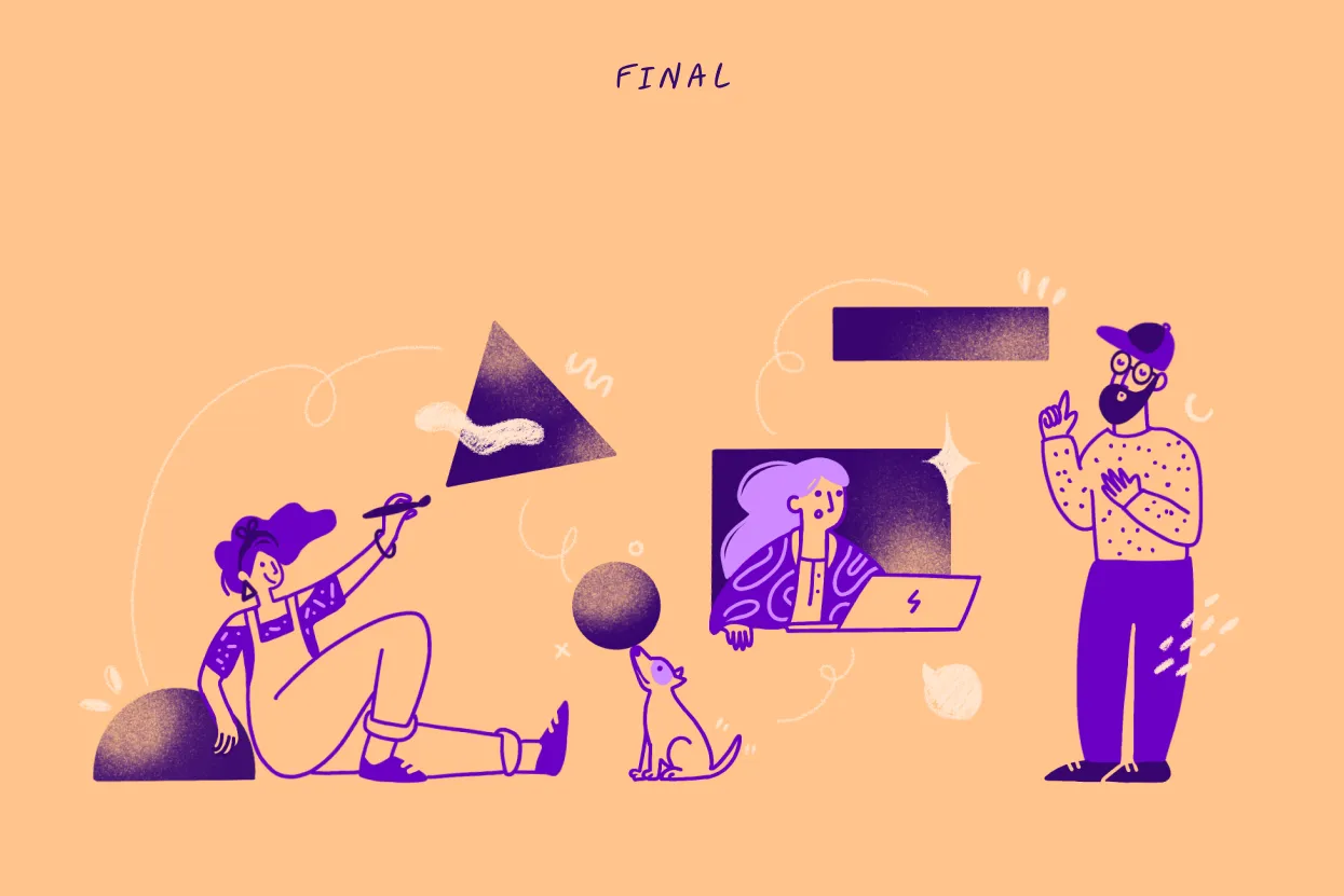
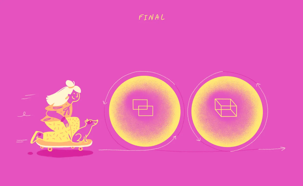
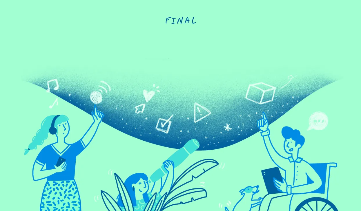
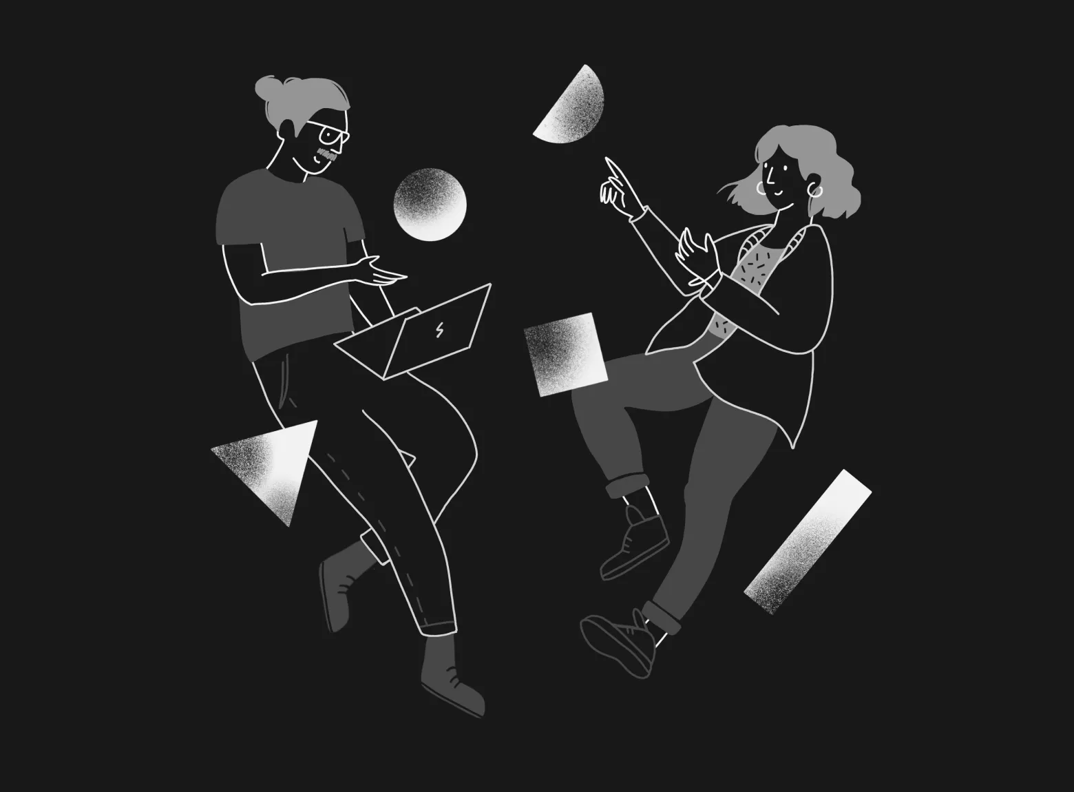
The final solution consisted of four custom illustrations that seamlessly fit into the landing page, visually complementing the 12 key concepts of Lean UX. Each illustration played a key role in telling the Lean UX story.
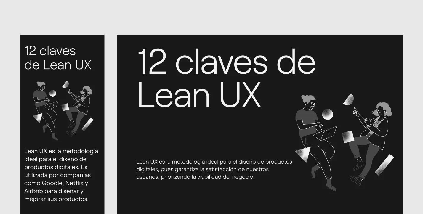
The illustration style was minimalistic, featuring clean lines and a monochromatic palette. Dynamic characters and abstract shapes conveyed movement and interaction.
Soft gradients and grainy textures added depth while maintaining a modern, playful aesthetic, well-suited to illustrating complex concepts in a clear and engaging way.
Intro
A balanced, inviting piece to introduce users to the core concepts.
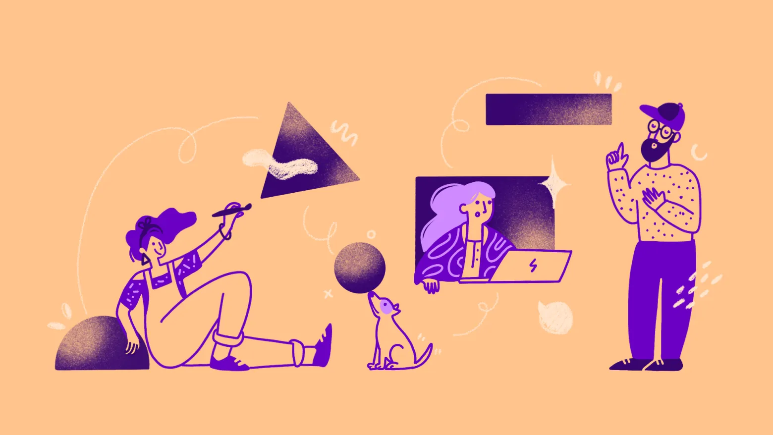
Team
Highlighting collaboration within cross-functional teams.
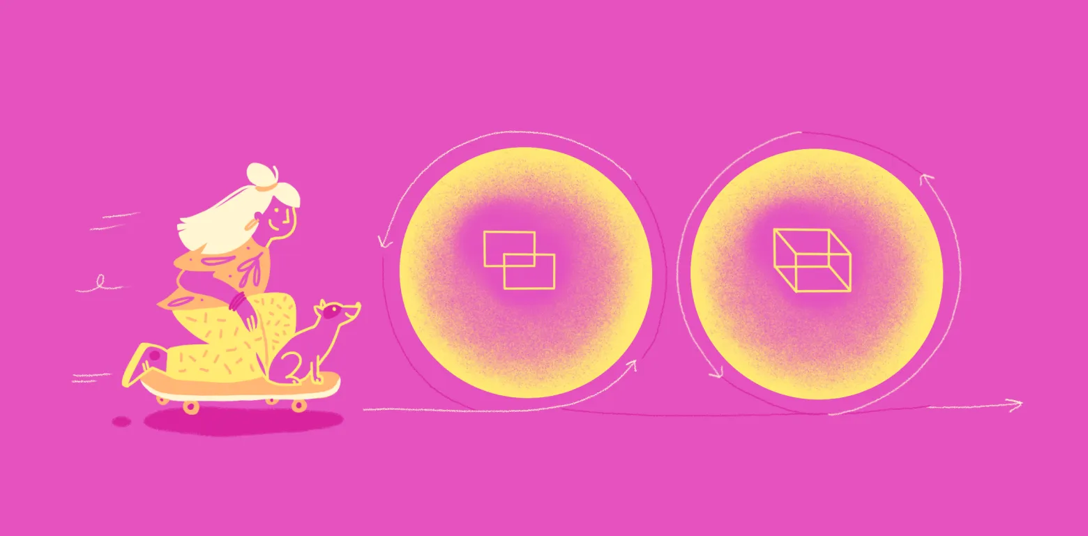
Process
Depicting the iterative cycle of continuous improvement.
Culture
Representing user research and continuous validation.

Conclusion
This project seamlessly integrated custom illustrations into a technical, content-heavy landing page, enhancing both clarity and visual coherence.
As a result, the page saw increased user engagement and improved retention. The illustrations not only supported the storytelling but also made the content more approachable and easy to navigate.
This collaboration highlighted how thoughtful illustrations can have a significant impact, contributing to both business goals and brand visibility.


