Client
Year
Role
Duration
2 days
My role encompassed concept design, typography selection, color palette creation, and vector illustration to bring the vision to life.


The challenge
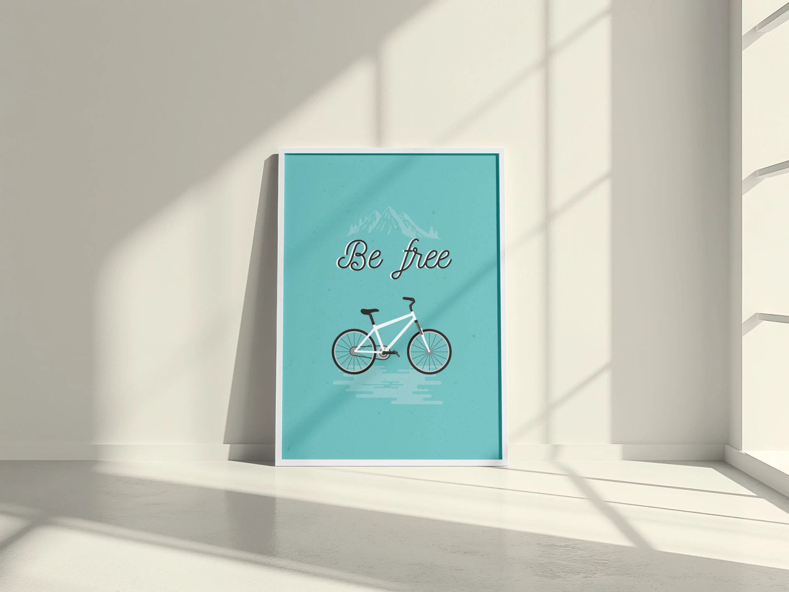
The client requested a personalized poster that would serve as both a decorative piece and a personal statement about his deep connection to nature and cycling.
The goal was to design something that was minimal yet expressive and that could seamlessly fit into any home environment. The artwork also needed to be easily scalable for printing at various sizes, without losing quality.
Additionally, we aimed to achieve a balance between simplicity and depth, ensuring the final piece reflected the client’s values.


The process
The process started by gathering visual inspiration reflecting the client’s lifestyle and interests. I proposed the phrase “Be Free” to align with the project’s theme and add a personal touch, resonating with the sound of the client’s name, Wifri.
I opted for a flat, vector-based illustration style to keep the design clean and flexible. Early iterations explored more intricate details and backgrounds, but through several rounds of refinement, it became clear that a more minimalist approach was the most effective.

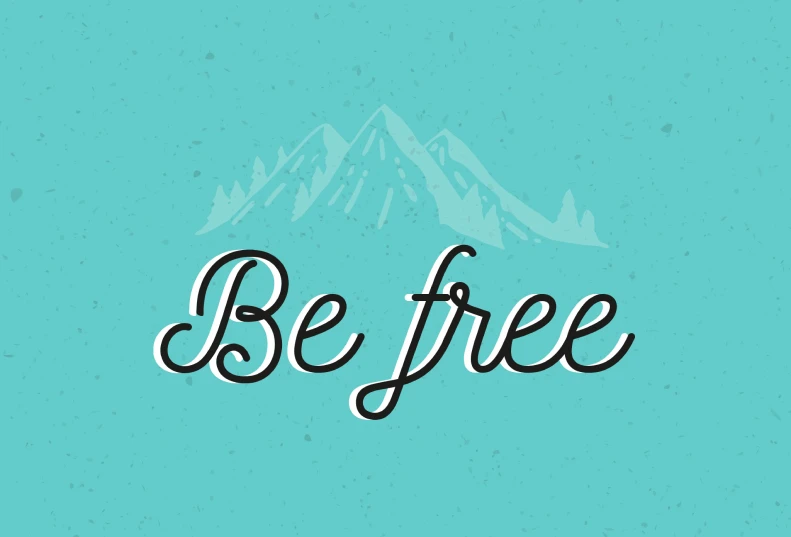
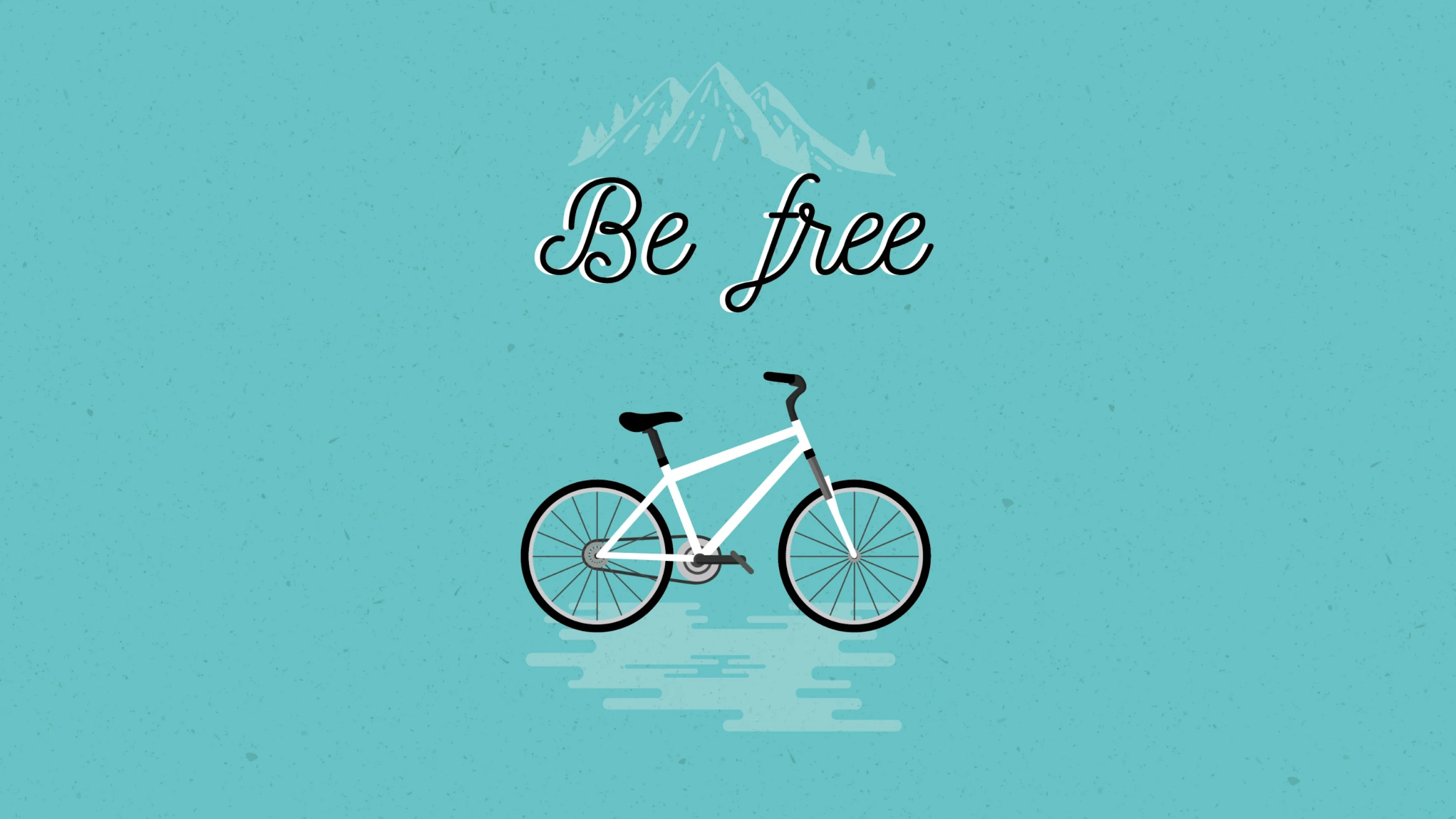
The typography was also carefully considered. After testing various fonts, I selected Nickainley, a script typeface that added warmth and personality, contrasting with the geometric lines of the illustration.
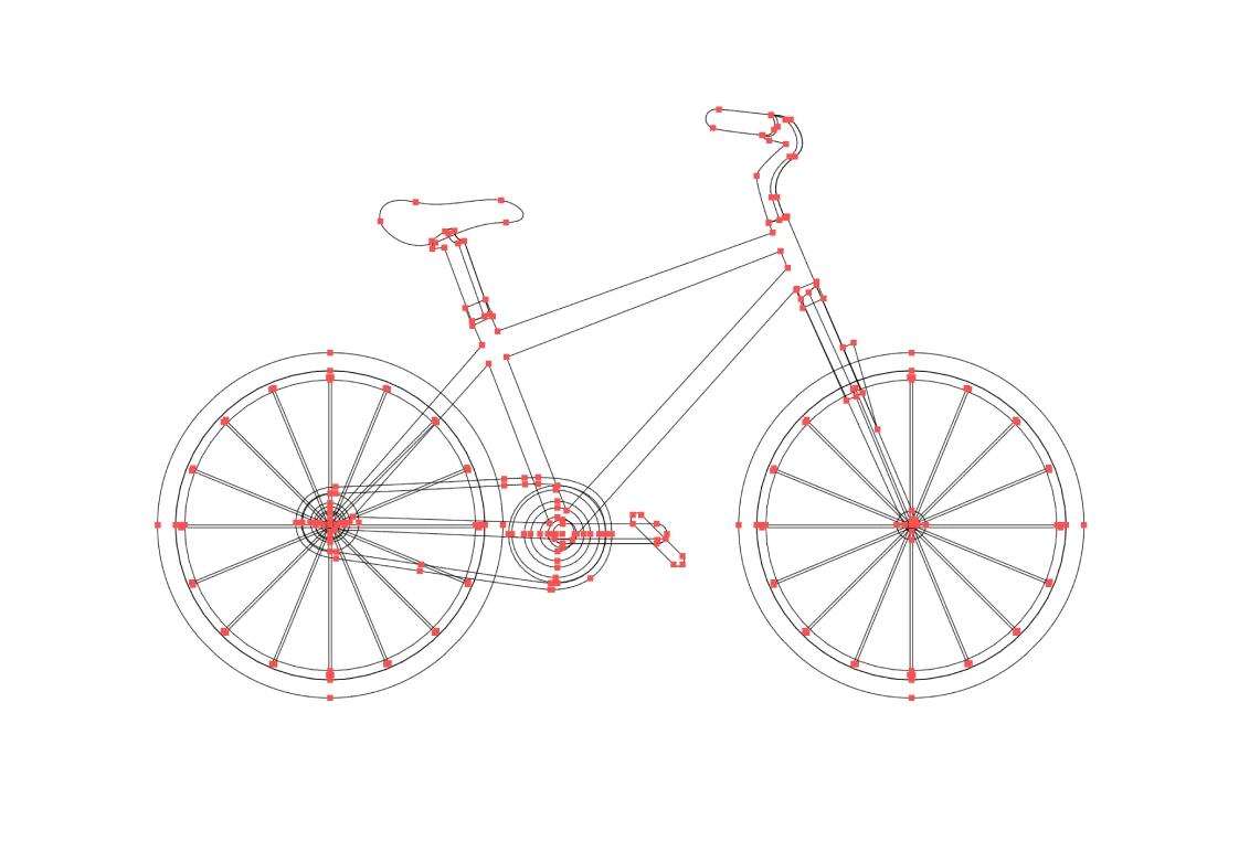
Finally, I created the illustration in Adobe Illustrator using a digital vector format. This ensured the artwork could be scaled to any print size, preserving sharpness and quality throughout.
The solution
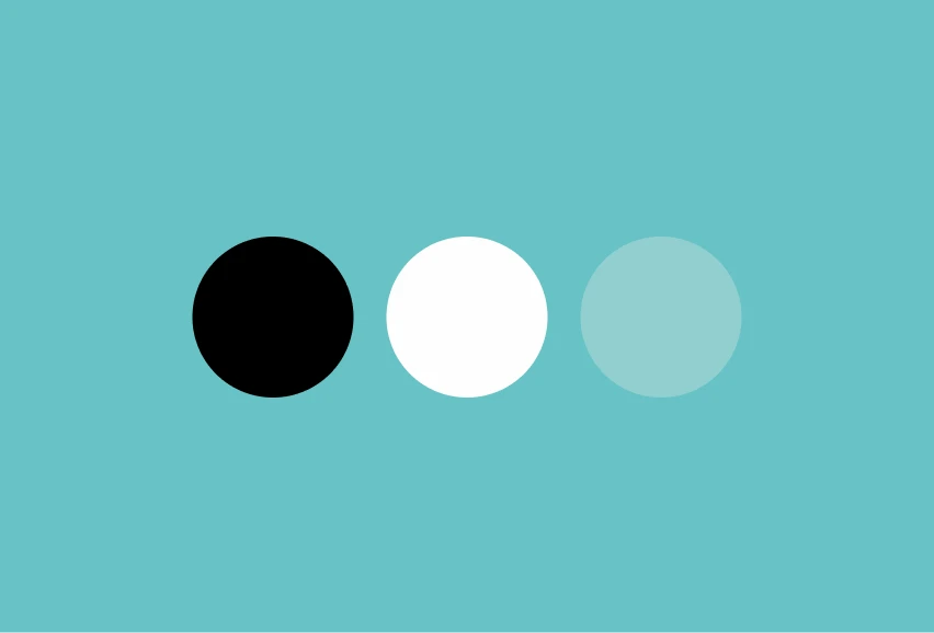
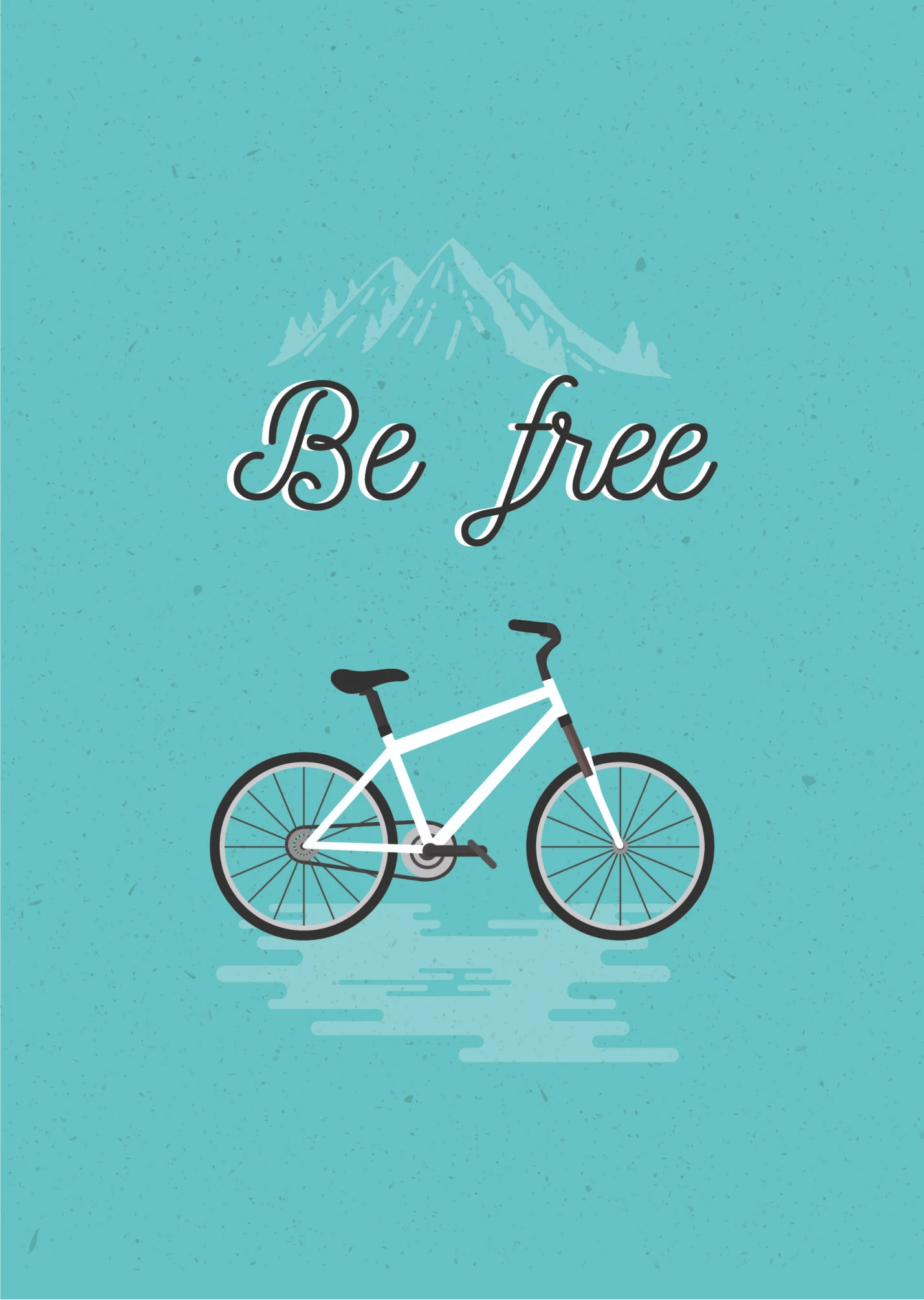
The final vector illustration features a minimalist bike in soft white tones, set against a serene turquoise backdrop. Subtle mountain outlines are barely visible behind the bike, symbolizing the connection between freedom and the client’s lifestyle.
To enhance the depth, I integrated textured elements into the background. The script typography added an emotional layer, balancing modern design with personal resonance.

Conclusion
This project successfully captured the client’s values, resulting in a design that was both meaningful and adaptable. The vector format ensured that it could be printed at any size while maintaining quality. The client was extremely satisfied with the outcome, appreciating how the design reflected his identity.
